About Nesta
We are Nesta, the UK's innovation agency for social good. We design, test and scale solutions to society's biggest problems. Our three missions are to give every child a fair start, help people live healthy lives and create a sustainable future where the economy works for both people and the planet.
For over 20 years, we have worked to support, encourage and inspire innovation.
We work in three roles: as an innovation partner working with frontline organisations to design and test new solutions, as a venture builder supporting new and early stage businesses and as a system shaper creating the conditions for innovation.
Harnessing the rigour of science and the creativity of design, we work relentlessly to change millions of lives for the better.
Find out more at nesta.org.uk
If you'd like this publication in an alternative format such as Braille or large print please contact us at [email protected]
Authors
- Dr Filippo Bianchi
Lead Behavioural Scientist, Nesta & BIT
- Frances Bain
Mission Manager Scotland, Nesta
- Dr Bobby Stuijfzand
Senior Research Advisor, BIT
- Darren Hillard
Analyst, Nesta
- James Farrington
Research Advisor, BIT
- Jovita Leung
Advisor, BIT
- Jordan Whitwell-Mak
Advisor, BIT
- Dr Abigail Mottershaw
Director of Research, BIT
Summary
Nesta worked with the Behavioural Insights Team on a study to explore the potential impact of calorie labels in food delivery apps.
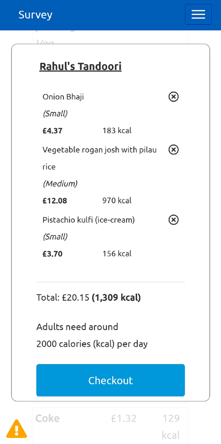
8,780 adult participants were asked to do a hypothetical takeaway order on our simulated food delivery app. Participants were randomly allocated to do this task on one of eight different versions of the app: one version featured no calorie labels, and the other versions featured one of seven calorie label designs. We then compared how many calories people purchased in the different groups. Following the trial, participants were also asked what they thought about displaying calorie labels in this way.
Five out of seven labels significantly reduced calorie purchases. Design characteristics linked with greater effectiveness included a filter that allows customers to hide or show the calorie information, a summary of total calorie purchased at checkout, positioning calorie labels between the product description and the price and using a unique font for the calorie label. There was strong support for featuring calorie labels in delivery apps.
Why we did this study
Obesity is a serious health challenge: In the UK, 63% of adults are overweight, and obesity rates are 80% higher in the most deprived areas compared to the least deprived.
Delivery apps contribute to the obesity problem: Out of home (OOH) meals are 21% more calorie dense than meals cooked at home.
People are increasingly using delivery apps: In 2020, the number of adults ordering food from delivery apps reached 24.8 millions. This represents a 55% increase from 2015.
Calorie labels could help reduce calorie intake: Labelling interventions emerged as a potentially promising approach to promote healthier food choices in previous research.
The Scottish Government is consulting on proposals to introduce calorie labelling at the 'point of choice', including on menus and online for OOH food outlets in Scotland. Regulations to make calorie labelling mandatory in the out of home sector came into force in England in April 2022. In Wales, a consultation was launched on introducing mandatory calorie labelling in June 2022.
Our findings
Main findings
- On average, all calorie label designs led to lower calorie purchases than the control, with most labels achieving statistically significant effects. No label increased the number of calories purchased. Based on the results of this simulated trial, the introduction of calorie labels is likely to contribute towards reducing calorie intake in the OOH sector and unlikely to backfire.
- Effect sizes ranged from a 2% non statistically significant reduction in calorie purchases to a 8% statistically significant reduction in calorie purchases. The median effect across the seven interventions was a 5% statistically significant reduction in calorie purchases.
- Public acceptability for the introduction of calorie labels was very high and only varied minimally between different label designs. Between 71 and 76% of people actively supported the introduction of calorie labels, 15 to 18% of people felt indifferent, and 8 to 12% opposed the labels. Not introducing a calorie label was the least popular option with only 28% of people supporting the idea.
Other findings
We also identified design characteristics of calorie labels that were typically linked with greater reductions in excess calorie purchases. However, we did not test the impact of all of these features for statistical significance and so some of these effects might have occurred by chance
- Adding a filter that allows people to hide or show calorie labels directionally increased the effectiveness of the labels at reducing calories purchased. The filters reduced calorie purchases even among people who did not activate the filter to 'show the calorie labels' or who did use the filter to 'hide the calorie label'. The mere presence of the filter helped to reduce calorie purchases, likely due to priming and motivational mechanisms.
- On average, there was no difference between the effectiveness of a 'switch on' filter (i.e. a filter that allows people to 'display' calorie labels) and a 'switch off' filter (i.e. a filter that allows people to 'hide' calorie labels). However, the filter to 'hide calorie labels' achieved medium effect sizes across a wider number of people, while the filter to 'show calorie labels' achieved large effects among people who used it to display the labels and only small effects among those who did not.
- Adding a summary of the total calories purchased in the overall shopping basket directionally increased the effectiveness of the calorie label at reducing calorie purchases. This feature might work by making it easy for people to understand how many calories they have in their overall meal without having to add up the calories of their foods manually.
- The location in which calorie labels are displayed on menus affected the effectiveness of the labels. Positioning the label between the product description and the price worked directionally better than positioning the label to the right of the price. This might be because people tend to read information from left to right and so some might not attend to information that is positioned further to the right of the price.
- Labels in 'smaller' fonts worked directionally better at reducing calorie purchases, suggesting that using a 'unique' font for the calorie label (i.e. a font not used for any other element of the user interface) might draw people's attention to it. Small fonts might not be accessible and inclusive to all. As such, differentiating the calorie label through other techniques (e.g. 'bold fonts') might deliver a similar 'prominence' effects in a more inclusive way.
- All effective interventions reduced the amount that people spent on the simulated platform by £0.75-1.34 per order. If this effect replicates in the field, labels could help consumers make lower-calorie choices whilst also saving money but, for businesses, this could represent a feasibility barrier to the implementation of calorie labels.
How it worked
We conducted a randomised controlled trial testing seven different designs of calorie labels against a no-intervention control group
This diagram illustrates the trial design, showing participants flowing from "8,780 adult users of food delivery platforms (Nationally representative of UK in terms of gender, age, income, and region)" to a "Randomisation" step, leading to eight different groups: "Control" and "Label 1" through "Label 7".
Below the main flow, a blockquote contains the instructions given to participants:
"Imagine you are using our online delivery platform to order food for a single meal for yourself. You can use our food delivery platform just like you would in real life: you can browse through multiple restaurants, view their menus, and add or remove foods from your basket. Once you are happy with your order, you can click 'checkout' to complete the task."
The diagram also lists the outcomes measured:
Primary outcome measure:
- Calorie content of the hypothetical order on the simulated food delivery platform
Secondary outcomes:
- Basket price
- Acceptability of calorie label
Control: 1,178 people were shown the platform with no calorie labels.
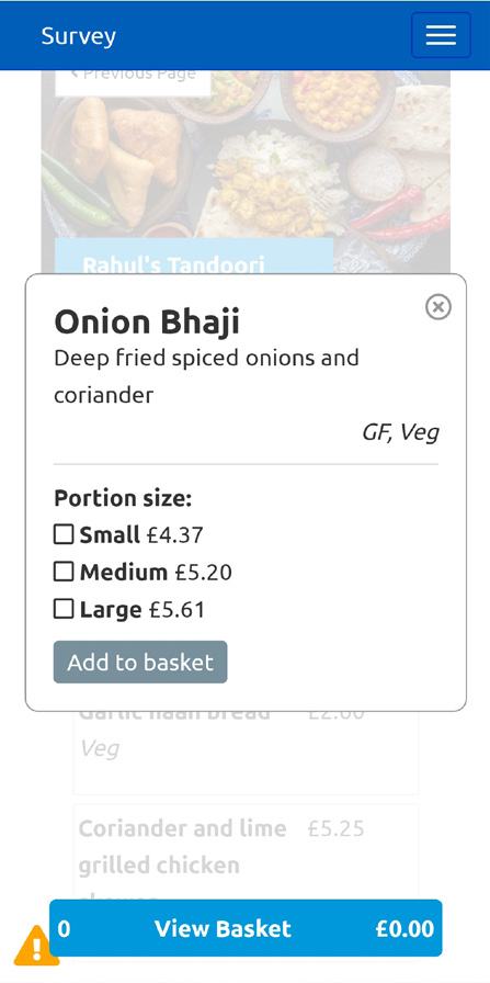
Label 1: 1,012 people were shown labels to the right of food prices using the same font size.
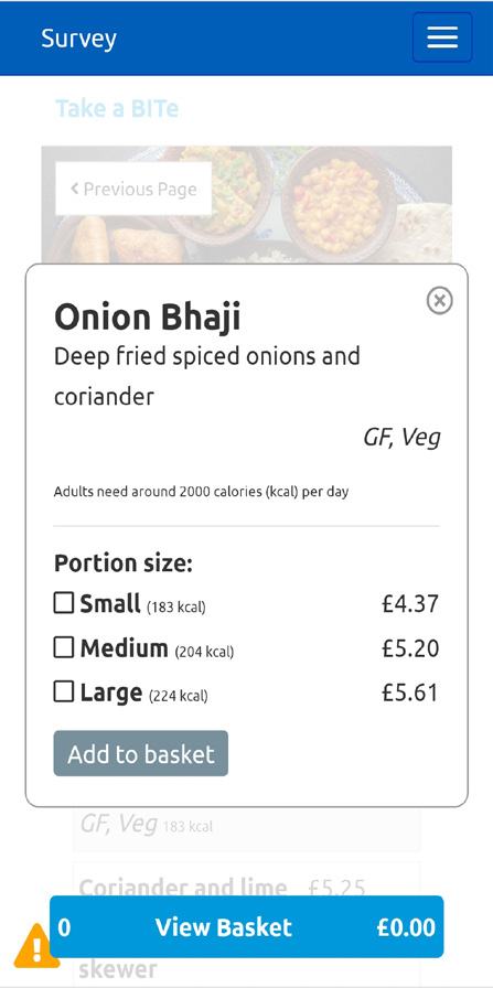
Label 2: 1,114 people were shown labels next to the product description using the same font size as for the food prices.
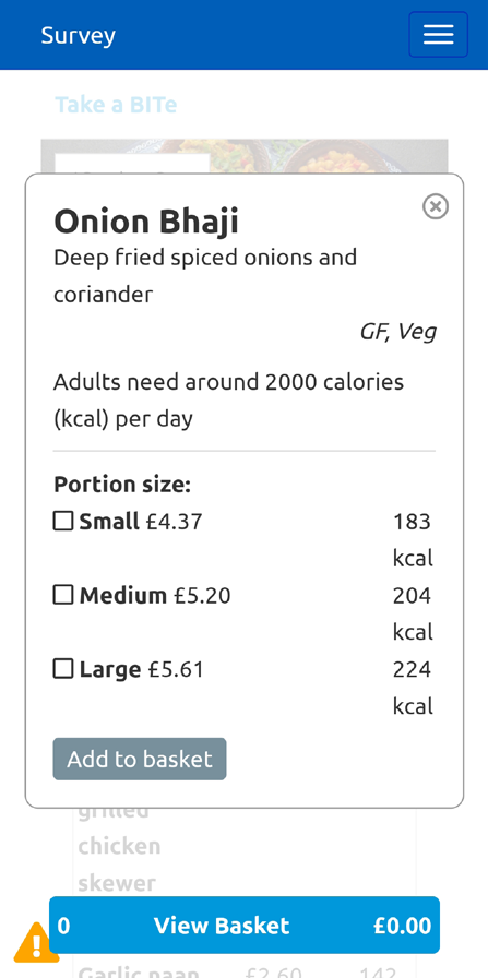
Label 3: 1,152 people were shown labels to the right of food prices but using a smaller font size.
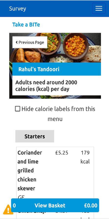
Label 4: 1,090 people were shown labels next to the product description but using a smaller font size.
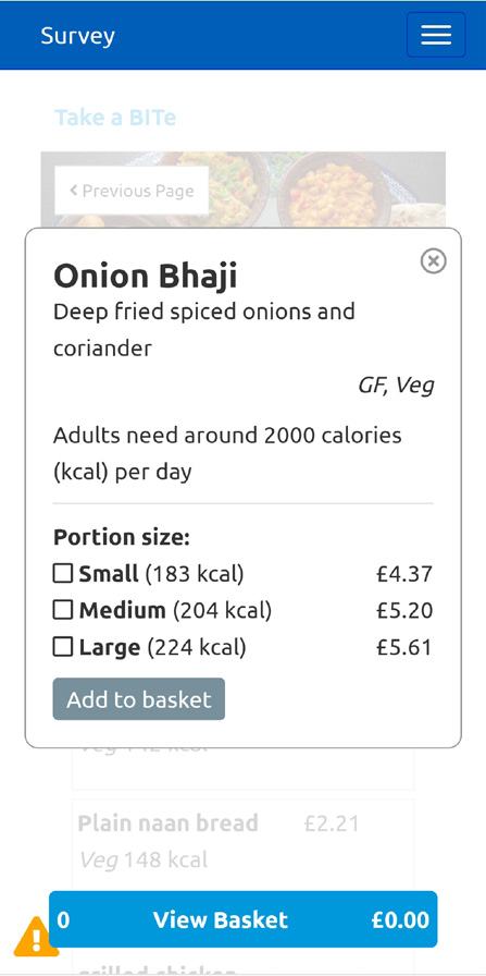
Label 5: 1,015 people were shown Label 1 but with the choice to turn labelling off.
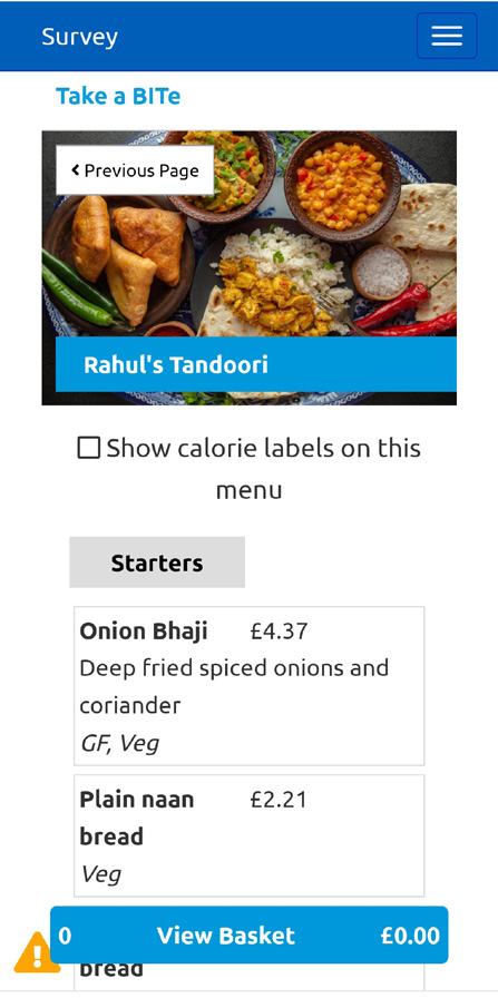
Label 6: 1,124 people were shown no label but with the option to turn on Label 1.
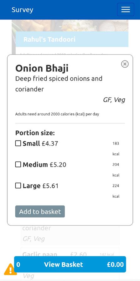
Label 7: 11,095 people were shown Label 1 with an additional summary of the total number of calories in the basket at the checkout.
Results, policy implications and hypotheses
Policy insight: All but two calorie labels significantly reduced the amount of excess calories ordered by the participants. And, based on the results of this simulated trial, any type of calorie label is unlikely to backfire on average.
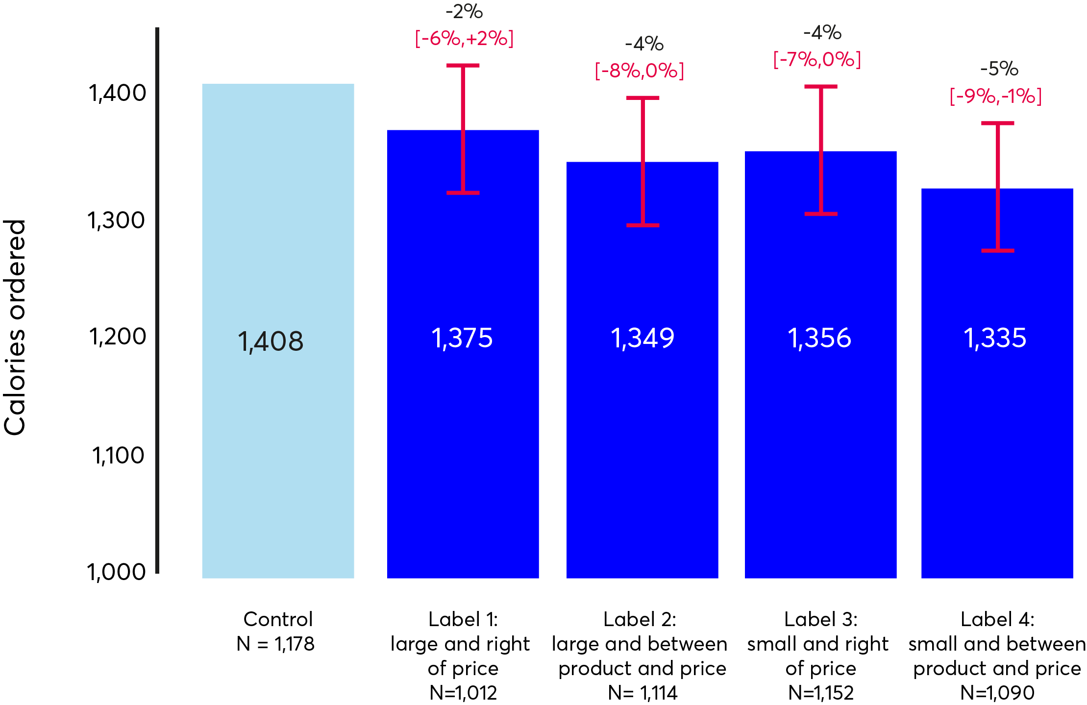
Effects for labels 2 and 4 are statistically significant at p<0.05. Values in brackets are 95% confidence intervals.
The two labels that were positioned between the product description and the price led to significant reductions in excess calorie purchases.
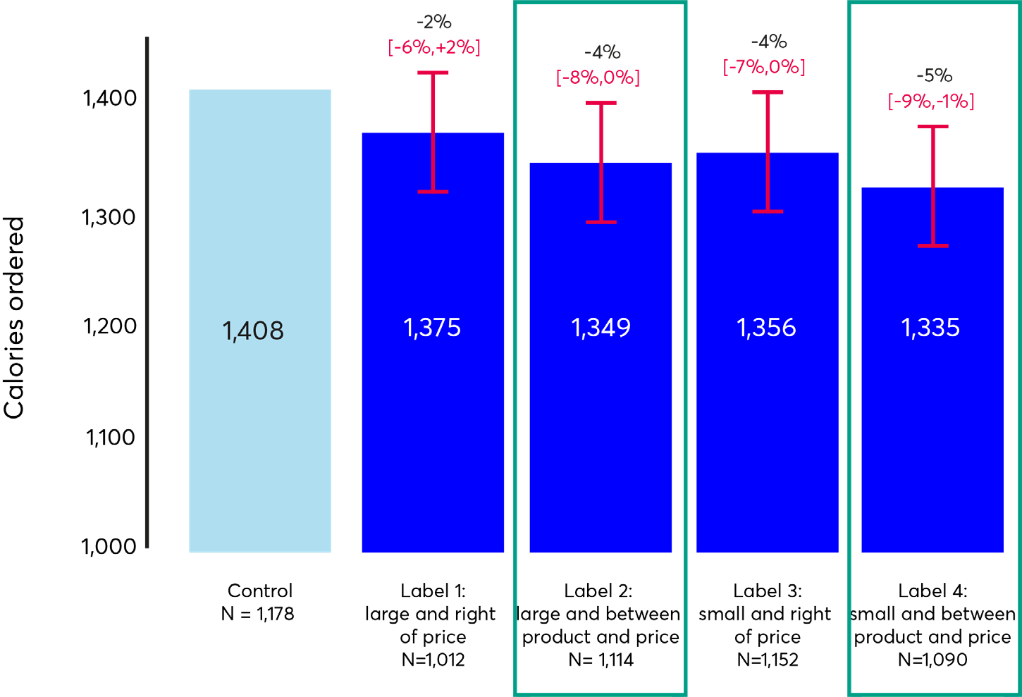
The two interventions in which the calorie label was positioned to the right of prices were not found to significantly reduce calorie purchases.
Policy insight: The location of the calorie label matters. Positioning the label between the product description and the price seemed to work better than positioning the label to the right of the prices in our simulated delivery app.
Why might this be?
Hypothesis
It is possible that the price is not always the most prominent location on our simulated food delivery app.
People tend to read from left to right. If this allows them to see the product description and its respective price they might not be incentivised to read further.
Implication
Regulating that the calorie labels needs to be located to the left of the prices might better leverage the prominence effect.
The font of the calorie labels might also matter
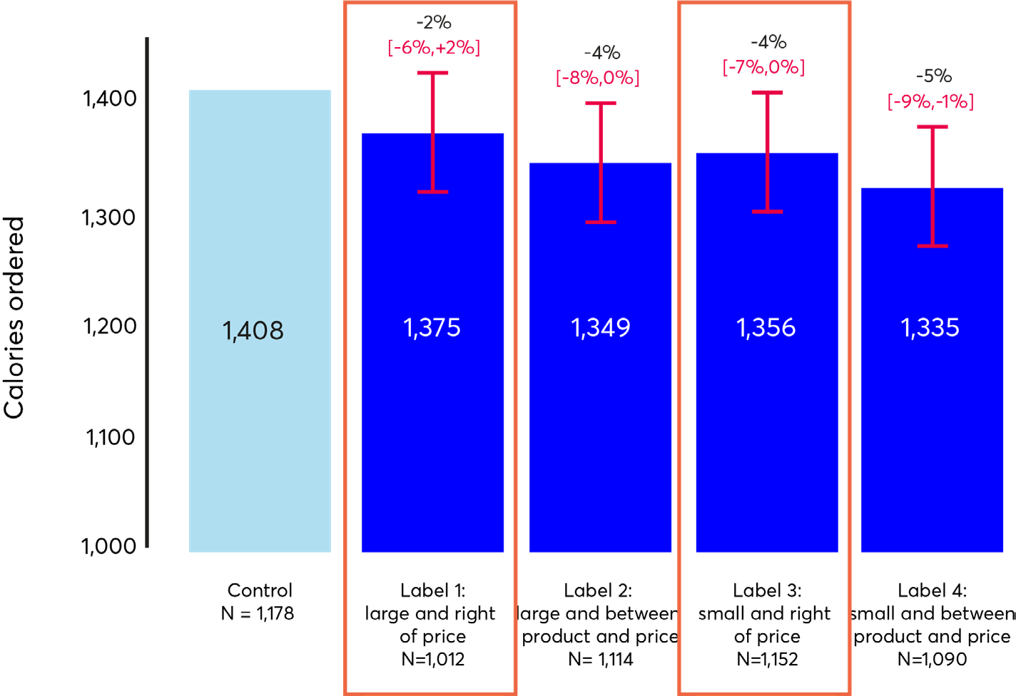
A bar chart titled "To the right of prices" showing average calories ordered across a control group and groups with different calorie labeling interventions (Label 1: Large and right of price; Label 2: Large and between product and price; Label 3: Small and right of price; Label 4: Small and between product and price), including error bars and percentage changes.
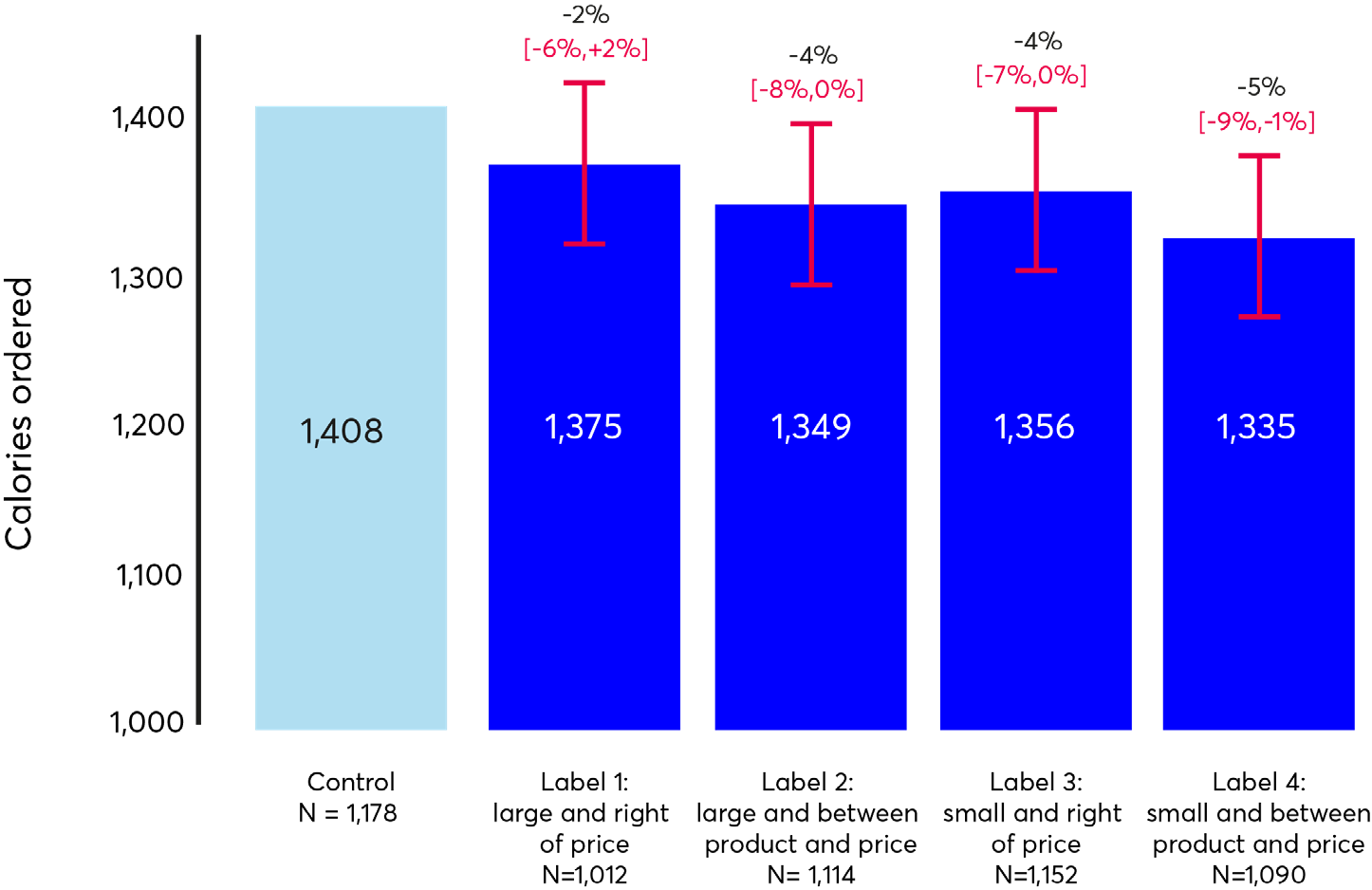
For labels positioned next to the price, the labels in the small fonts worked directionally better at reducing excess calorie purchases.
A bar chart titled "Between product and price" showing average calories ordered across a control group and groups with different calorie labeling interventions (Label 1: Large and right of price; Label 2: Large and between product and price; Label 3: Small and right of price; Label 4: Small and between product and price), including error bars and percentage changes.
For labels positioned between the product and the price, the labels in the small fonts still worked directionally better at reducing excesscalorie purchases.
Policy insight: Overall, the 'smaller' font worked directionally better at reducing excess calorie purchases. However, caution must be exercised when interpreting this result since – in general – larger elements of a user interface tend to be more prominent.
Why might this be?
Hypothesis 1
Elements of the user interfaces that have a 'unique' characteristic tend to attract our attention. In our delivery app, the small calorie label was the only element that used different font size, which might have 'attracted attention' to it.
Hypothesis 2
Smaller fonts were described by some participants in a complementary qualitative study as 'more discrete and acceptable', which might have increased engagement with the label. However, other participants flagged the risk that small fonts might 'not be accessible and inclusive' for people who struggle to read small text.
Implication
Regulating that the font of the calorie label needs to be different compared to other elements of the user interface could help draw attention to it. As smaller fonts may not be accessible, using 'colours' or 'bold' fonts could represent more equitable alternatives to draw users' attention to calorie information.
Policy insight: Adding a filter that allows people to show or hide the calorie labels directionally increased the labels' effectiveness at reducing excess calorie purchases on our simulated delivery app. We introduced these filters also with the aim of addressing concerns that calorie information could represent a negative trigger for people with eating disorders.
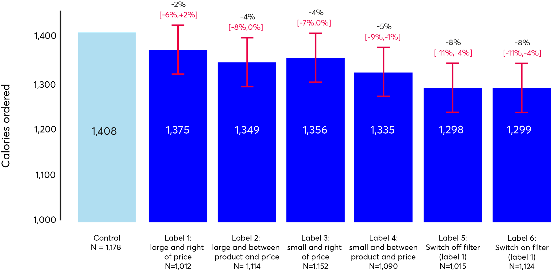
Effects for labels 2 and 4 are statistically significant at p<0.05, effects for labels 5 and 6 are statistically significant at p<0.01. Values in brackets are 95% confidence intervals.
On average, there was no difference between the effectiveness of:
- a 'switch on' filter (i.e. a filter that allows people to 'display' calorie labels)
- a 'switch off' filter (i.e. a filter that allows people to 'hide' calorie labels)
From the perspective of 'average effect sizes', there was no difference on whether the calorie label was shown by default or had to be selected.
| Canton Feast |
Adults need around 2000 calories (kcal) per day |
| Starters |
Hide calorie labels from this menu |
|
|
|
Pan-fried dumplings (vegetable) |
|
V, Veg |
|
Duck buns with hoisin sauce |
|
|
|
Duck spring rolls |
|
|
Label 5: 1,015 people were shown Label 1 but with the choice to turn labelling off.
Among participants seeing label 5, 15% of people had the filter engaged at check out. This means that 15% of participants decided to hide the calorie label at check-out.
There was no large difference in the amount of calories purchased between those who hid the labels at check out (1,293 kcal) and those who did not (1,303 kcal). Both types of users seeing label 5, ordered significantly fewer excess calories compared to the control (1408 kcal).
Among participants seeing label 6, 25% had the filter engaged at checkout. This means that 25% of participants decided to show the calorie label at check-out.
Those who engaged with the filter to show the calorie information ordered less calories (1,173 kcal) than those who did not use the filter to show the calorie labels (1,356 kcal). However, even users who did not engage with the filter ordered fewer calories than the control (1408 kcal).
Policy insight: A filter to 'hide calorie labels' achieves medium effect sizes across a wider number of people. A filter to 'show calorie labels' achieves large effects among those who engage with it and small effects among those who do not. The former might therefore be more equitable and mitigate the risk of exacerbating health inequalities.
Policy insight: The mere presence of the filter can help to reduce calorie purchases. Even for people who do not activate the filter to 'show the calorie labels' or who decide to 'hide the calorie label'. This is likely due to motivational mechanisms.
Policy insight: Adding a summary of the calories purchased in the basket directionally increased the effectiveness of the calorie label at reducing excess calorie purchases.
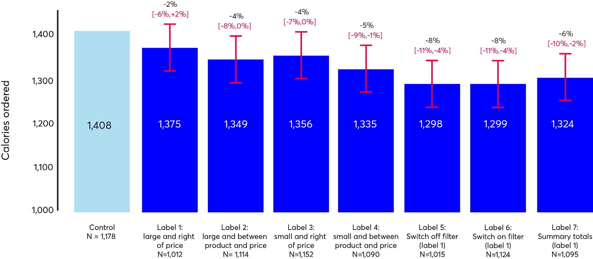
Effects for labels 2 and 4 are statistically significant at p<0.05, effects for labels 5, 6, and 7 are statistically significant at p<0.01. Values in brackets are 95% confidence intervals.
Financial impact of the interventions
All effective interventions reduced the amount that people spent on the platform by £0.75-1.34/order. If this effect replicates in the field, labels could help consumers make lower-calorie choices whilst also saving money but, for businesses, this could represent a feasibility barrier to the implementation of calorie labels.
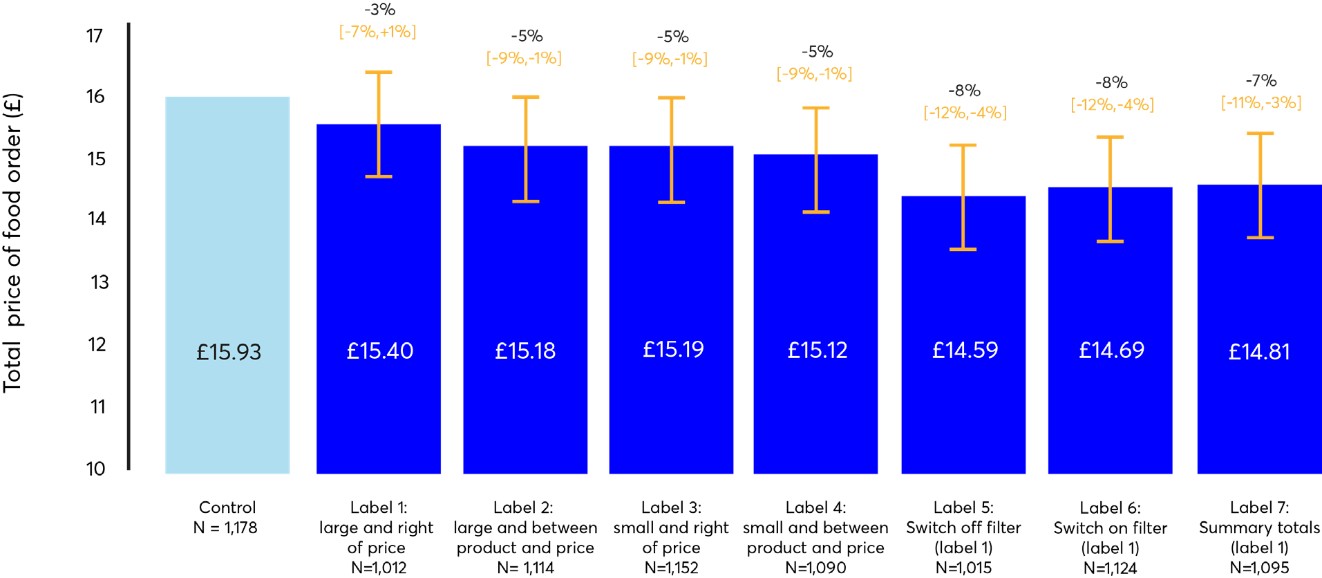
Effects for labels 2, 3, and 4 are statistically significant at p<0.05, effects for labels 5, 6, and 7 are statistically significant at p<0.01. Values in brackets are 95% confidence intervals.
Acceptability of intervention
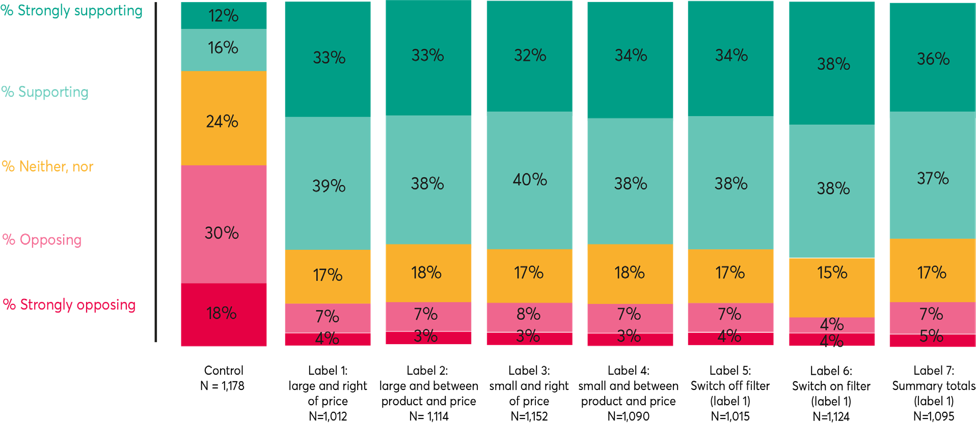
Public acceptability for the introduction of calorie labels was very high and only varied minimally between different label designs. 71-76% of people actively supported the introduction of calorie labels, 15-18% of people felt indifferent, and 8-12% opposed the labels. Not introducing a calorie label was the least popular option: only 28% of people supported the idea of not introducing calorie labels and 48% of people actively opposed this idea.

58 Victoria Embankment
London EC4Y ODS
+44 (0)20 7438 2500
[email protected]
@nesta_uk
f nesta.uk
www.nesta.org.uk
ISBN: 978-1-913095-78-9
Nesta is a registered charity in England and Wales with company number 7706036 and charity number 1144091. Registered as a charity in Scotland number SCO42833. Registered office: 58 Victoria Embankment, London EC4Y ODS.
Creative Commons Attribution-NonCommercial-ShareAlike 4.0 International License (CC BY NC SA)