Introduction
Wealth and income in the United Kingdom are not distributed equally. But what does this really mean for people across the country? And how do current levels of inequality compare to past levels, as well as to other countries?
On the face of it, income inequality is a simple concept: the extent to which incomes are spread unevenly in a group of people. Similarly, wealth inequality is the extent to which wealth is distributed unevenly in a group of people.
Looking at a single measure of inequality might give a part of the story. But, the picture becomes richer when we combine both income and wealth along with data on relative poverty, home ownership rates and inheritances. This allows us to better interpret what might be happening 'under the hood' and to paint a more detailed, and ultimately more useful, picture of inequality across the UK.
These 10 fundamental facts show the extent and nature of income and wealth inequality now. They also show what the implications of economic inequality could be in the future, as we look ahead to 2040.
Inequality is, of course, so much broader than the gap between the rich and the poor. We are addressing inequalities explicitly and consciously in all the themes covered in UK 2040 Options. But disparities in income and wealth have real and material impacts on people's lives, affecting their ability to save, own a home or afford rent, access basic goods and services, and pass on opportunities to their children. Policy options that can therefore tackle the challenges presented by income and wealth inequality will be needed, particularly as we look to 2040.
You can also view dynamic versions of the charts shown throughout this document.
On most measures, the UK has high levels of income inequality compared to other similar countries
This includes countries that we consider to be our economic peers, or to have similar living standards to us.
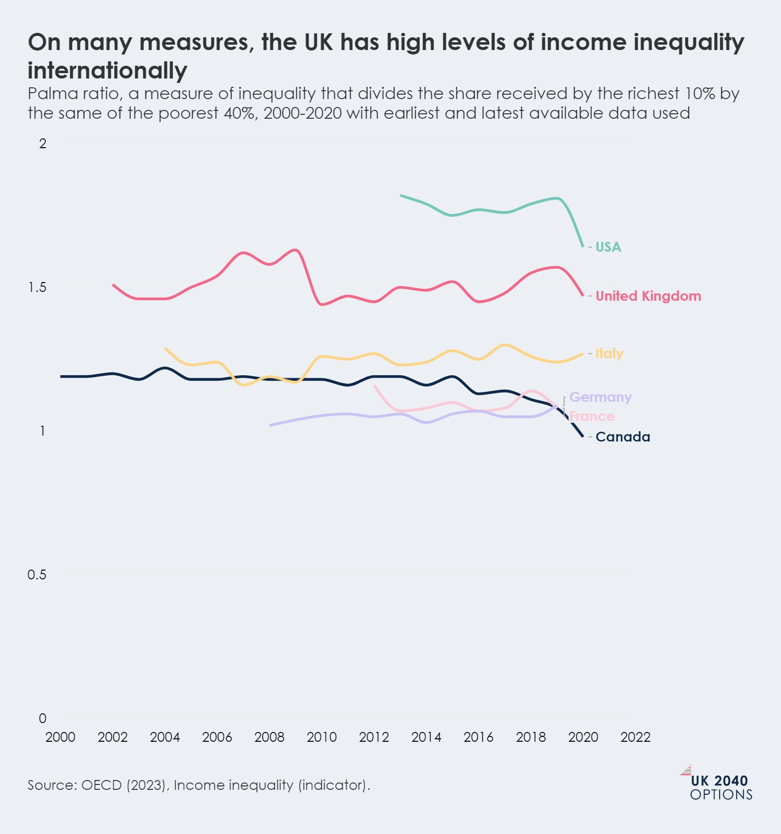
Income inequality is the extent to which income is distributed unevenly within a society. Drawing on a number of different measures, we can see the same picture: the UK has internationally high levels of income inequality.
Zeroing in on measuring income inequality
There is no consensus on how best to measure income inequality, with experts using a variety of different approaches to gauge the level of inequality in a particular setting. We can use different summary and ratio measures to see how incomes are distributed within the UK.
- The Gini coefficient, the most commonly used summary statistic of income inequality, was most recently measured by the OECD at 35.5% for the United Kingdom. (A value of 0% would express perfect equality, where everyone has the same income, while a value of 100% would be extreme inequality, where one person had all the income.)
- The Palma Ratio for 2020-2021 was 1.5. This tells us that the richest 10% of the UK population have an income that is 1.5 times greater than the bottom 40% of the population.
- Using a different ratio, the P90/P10, we can tell that in 2020-2021 the top 10% of incomes had an income that was 4.5 times greater than the bottom 10% of incomes.
- Using the quintile share ratio, we can see the income share received by the top 20% of the population in 2021 was 6.3 times greater than the income share received by the bottom 20% of the population.
These ratio measures can make this disparity feel abstract. So, putting this into 'pounds and pence', in 2021-2022, the weekly disposable income of a household of a couple with no children before housing costs in the richest 10% of incomes was greater than £1,000. For those in the bottom 10%, weekly disposable income before housing costs was below £270.
The UK has the second-highest income inequality in the G7
Gini coefficient, 2021 or latest available, for all G7 nations. A Gini coefficient of 100% represents complete inequality, while a Gini coefficient of 0% represents complete equality
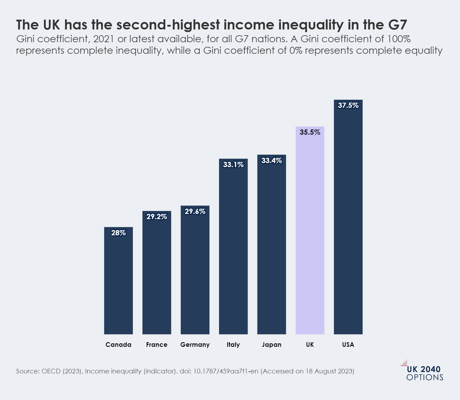
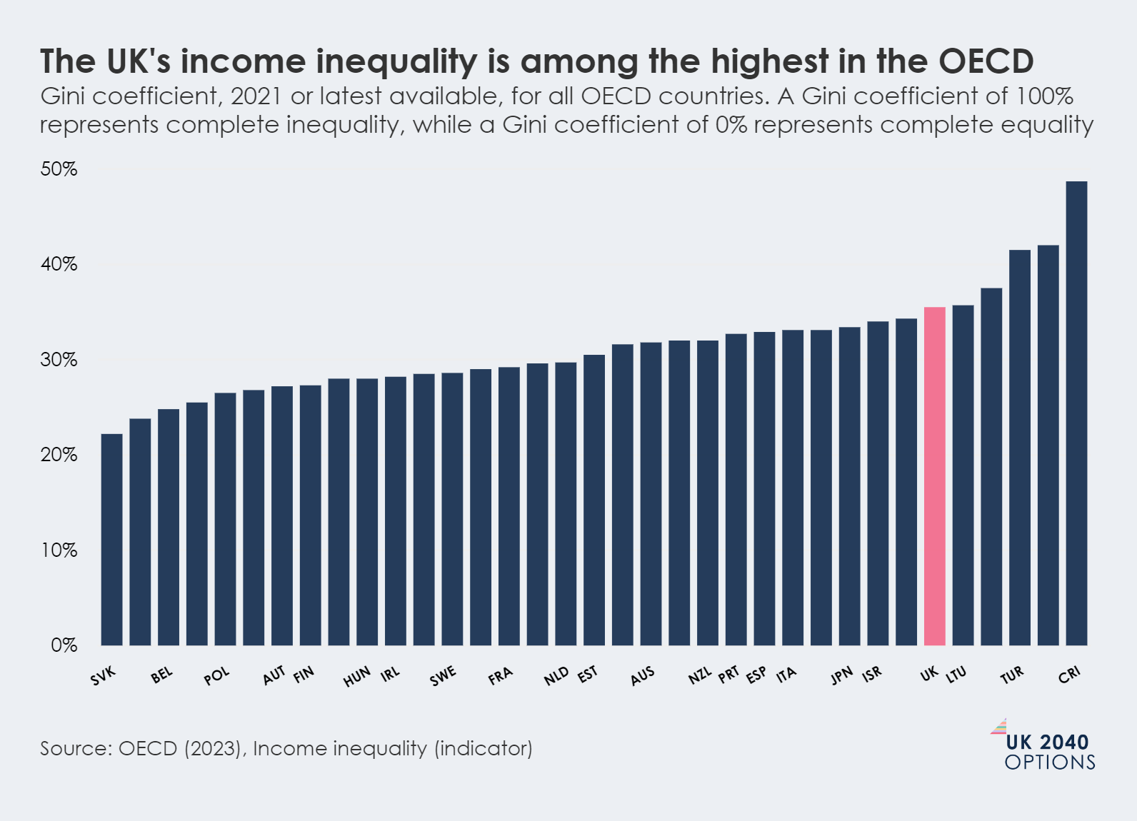
Globally, most countries have higher income inequality now than in the late 20th century, but income inequality in the UK saw one of the earliest and largest rises across OECD countries. The UK now has one of the highest levels of income inequality in Europe, and the second highest in the G7 – countries that we normally consider to be our peers in terms of economic opportunity and living standards. The United States remains more unequal.
The UK's income inequality is among the highest in the OECD
Gini coefficient, 2021 or latest available, for all OECD countries. A Gini coefficient of 100% represents complete inequality, while a Gini coefficient of 0% represents complete equality
On many measures, the UK has high levels of income inequality internationally
Palma ratio, a measure of inequality that divides the share received by the richest 10% by the same of the poorest 40%, 2000-2020 with earliest and latest available data used
The level of income inequality in the UK in recent decades has remained high and is likely to increase over the next five years
A rapid growth in investment income, driven by rising interest rates, is likely to drive higher incomes among richer households.
Income inequality in the UK has not always been this high. The increase has been driven largely by extensive and rapid growth in income inequality in the 1980s.
The UK saw a big rise in income inequality in the 1980s. It has not meaningfully reduced since.
Gini coefficient for equivalised household disposable income before housing costs, from 1961 to 2021-2022
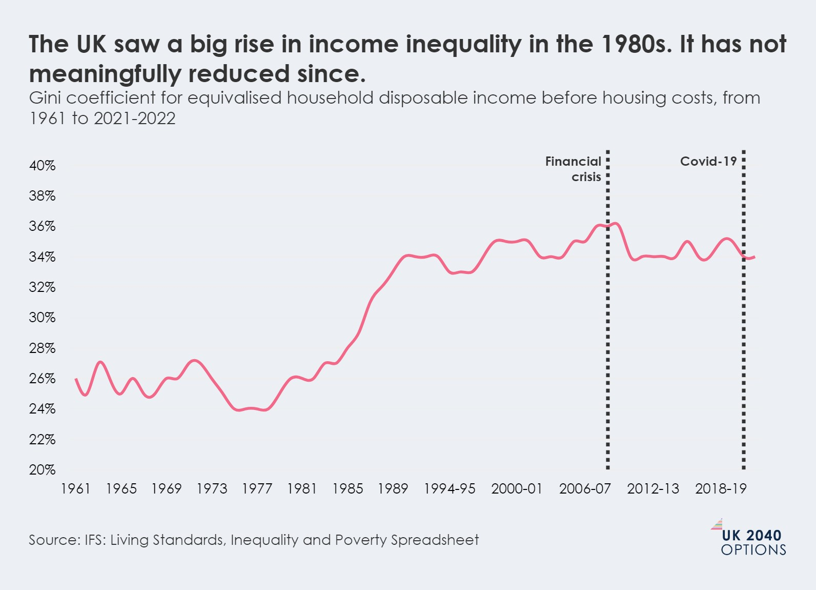
We can roughly separate the trends in changes to income inequality in the UK since the 1960s into four time periods.
- In the 1960s and 1970s, incomes grew at similar rates for low-, middle- and high-income households, meaning that the Gini coefficient remained relatively stable.
- In the 1980s, income inequality increased both rapidly and substantially across the board. The 1980s has been described as a transformative decade for income inequality in the UK, with the major increase in inequality driven by increased inequality in hourly wages and earnings.
- From the early 1990s until the 2007-2008 financial crisis, incomes changed in a way that flattened the distribution. This was not the case for incomes at the very top (the top 1%), which continued to pull away from the incomes of the richest 10%, until the financial crisis stalled the rise in income inequality.
- From the late 2000s until the Covid-19 pandemic, the UK's weak income growth was evenly spread across the income distribution (see section below on wage growth), and there has been little change to the level of income inequality when looking at the Gini coefficient. However, some measures of inequality in this timeframe – particularly those that reflect the very highest incomes - show a clear upwards trend in income inequality since the financial crisis, with some now again at a 10-year high (see the graph below).
After the financial crisis, many measures of income inequality fell back - but some still show an upward trend
P90/10 ratio, Palma ratio, and Share 80/20, equivalised disposable income, all people, UK 1977 through to financial year ending 2022
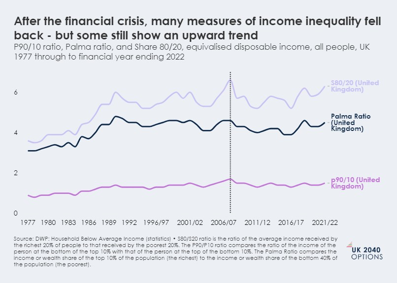
It is difficult to accurately predict what will happen to income inequality in the UK through to 2040. But in the very short run, it is likely that it will continue to deepen. The Resolution Foundation predicts that the rapid growth in investment income, which is driven by rising interest rates, will drive higher incomes among richer households.
Although a prediction, and therefore inherently uncertain, the Resolution Foundation forecasts the Gini coefficient will reach a record high of 40.8% in 2027-2028. This would make the UK almost as unequal in terms of income distribution as the United States is now.
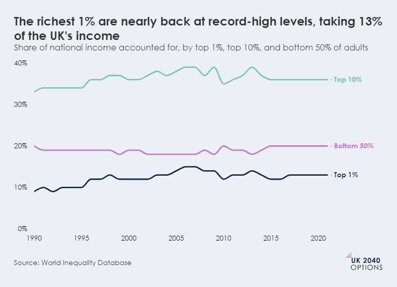
The richest 1% earn 13% of the UK's total income, just below the record levels seen before the 2008 global financial crisis
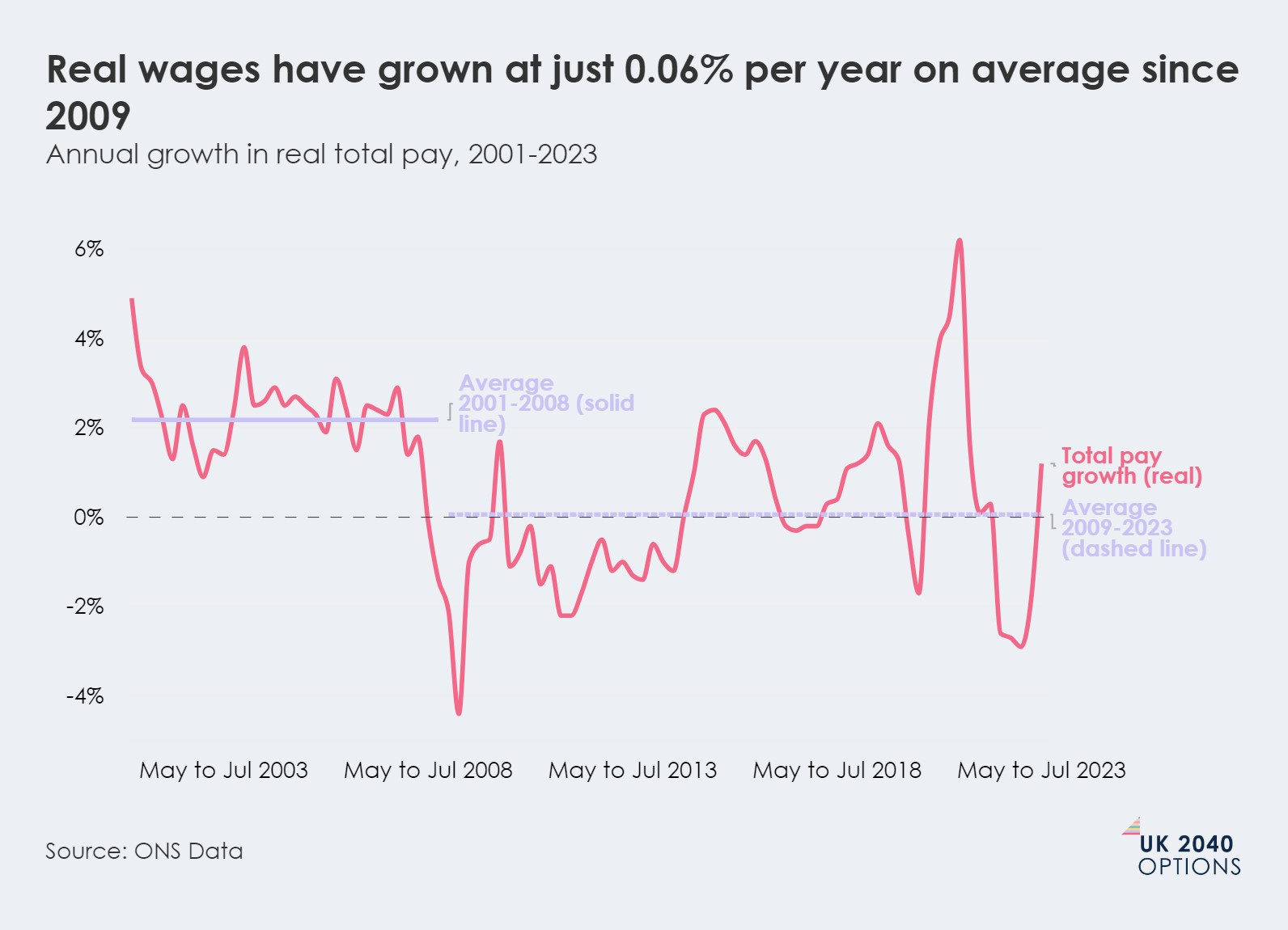
This is despite real wages stagnating for most people since 2009.
The people who make up the top 1% of the income distribution in the UK accounted for approximately 13% of national income in 2021. In stark contrast, the share of income earned by the entirety of the bottom 50% stood at 20%.
The richest 1% are nearly back at record-high levels, taking 13% of the UK's income
Share of national income accounted for, by top 1%, top 10%, and bottom 50% of adults
To be in the top 1% of income tax payers in the UK in 2019, a taxable income of at least £160,000 was required – this puts you roughly in the top 0.05% of the population. (By way of comparison, in 2019 43% of UK adults did not have an income that was high enough to pay tax, the threshold for which in 2019 was £12,500, and median income (after tax) was £29,600).
It is very difficult to accurately measure the exact incomes of the top 1% (which is why tax data is often used), and not much is generally known about them as a group. However, research from the Institute for Fiscal Studies (IFS) found that the top 1% of income tax payers in the UK tend to be disproportionately white, male and concentrated in London, making top incomes unequal across geography, ethnicity and gender.
But as we showed in our Economic Growth and Productivity Fundamentals, real wages (what people are paid when inflation is taken into account) have stagnated since 2009 for most people. Between 2001-2008, real wages grew an average of 2.17% per year, but between 2009-2023 they grew just 0.06% per year on average. This means that people's incomes, on average, when taking costs into account, have hardly grown at all for the last 13 years.
Real wages have grown at just 0.06% per year on average since 2009
Annual growth in real total pay, 2001-2023
Rates of relative poverty have fallen over the past decades although child poverty rates remain high
Relative poverty increased in the 1980s but has fallen slowly over the past three decades.
Rates of poverty – the proportion of households on low incomes – have remained relatively stable in recent decades. The most common measure of relative poverty is the proportion of people with a household income below 60% of the median income. This means that relative poverty can also be viewed as a measure of income inequality between middle-income households, and those on low incomes.
Using a mixture of data from official sources and data from the IFS, we can see from the graph below that one in five individuals were in relative poverty in 2020-2021. This is a statistic that has remained more or less constant since the 1990s, after poverty increased (for most) during the 1980s. However, separating this group into different demographics tells us a different story: groups have had very different experiences. For example, we can see that there has been a significant decline in the number of pensioners in relative poverty, from 38% in 1990 to 18% in 2020-2021. On the other hand, the number of children in poverty has remained relatively high, with 31% of children in relative poverty in 1990 through to 29% in 2020-2021.
One in five British people were in relative poverty in 2021-22
Percentage of demographic group in relative poverty (after housing costs) over time. Relative poverty is the percentage of individuals below 60% of contemporary median income.

Poverty is a challenging concept to measure. These measures of relative poverty, while allowing us to understand the differences between different groups in the UK, and make comparisons over time and between countries, can lie a long way from people's lived experiences. The measure has other limitations too: because it is anchored to median incomes, income gains made by the poorest will not show up in the measure if the median income also rises. At the same time, in periods of economic recession, it can sometimes seem like fewer people are in poverty because the median income might drop, even though material hardship or deprivation tends to rise in downturns.
It is also very difficult to project forward what might happen to the relative poverty rate by 2040. As the Joseph Rowntree Foundation (JRF) points out, trends in poverty depend on what might happen to the drivers of poverty: employment, earnings, benefits and tax credits and housing costs. But, given ever-increasing housing costs and social security policies that increase benefits at best in line with inflation, it is unlikely that measures of poverty will significantly decline any time soon.
Median incomes vary widely between regions, ethnic groups and disability status
Meaning that the region you live in, your ethnicity and whether you have a disability could have a significant impact on your income.
If we look at GDP per capita, the UK is one of the most regionally unequal developed countries in the world. (We explored the impact of this as part of our Economic growth and productivity fundamentals, where we considered how regional inequality plays out in the UK's productivity statistics). This trend also holds true for income inequality: median disposable incomes differ considerably between UK regions and devolved nations.
We can see this in the graph below. The median household income (after housing costs) in the West Midlands is 27% less than that of the South East. If we look at median household incomes before housing costs, London comes out on top, as high housing costs in the capital lower the median income once housing costs are taken into consideration, but the gap between the poorest and richest regions in England is just as large.
Typical household income in the richest region of England is more than 25% greater than in the poorest region
Median weekly income after housing costs: 2019-20 to 2021-22, equivalised 2021-22 prices
Median incomes tell us only about the standard of living for those in the middle of the pack. There are also visible differences in the relative poverty rate between regions. For example, JRF calculates that in the North East, the relative poverty rate is at 26%, for Yorkshire and the Humber it is 24% and for Wales it is 24%. This is compared to the relative poverty rate for the South West, which stands at 19%, and Scotland, which is 18%.
There is also a significant income difference in the UK between ethnic groups. As the graph below shows, the ethnic groups with the lowest median incomes were Bangladeshi and Pakistani, while white, Chinese and Indian ethnic groups had the highest median income.
Average income for some ethnic groups are double what they are for other ethnic groups in the UK
Median income by ethnic group: 2019-20 to 2021-22 prices
Again, the disparities in income play a part in impacting individual living standards. Looking again at the relative poverty rate, a similar pattern is shown: JRF calculates that around half of all people in households headed by someone of Bangladeshi origin were in poverty in 2021-22. Rates for people in households headed by someone of Pakistani or Black ethnicity were also very high with more than 4 in 10 in relative poverty. (This is more than twice the rate of people in households headed by someone of white ethnicity).
Being disabled has a huge impact on household income
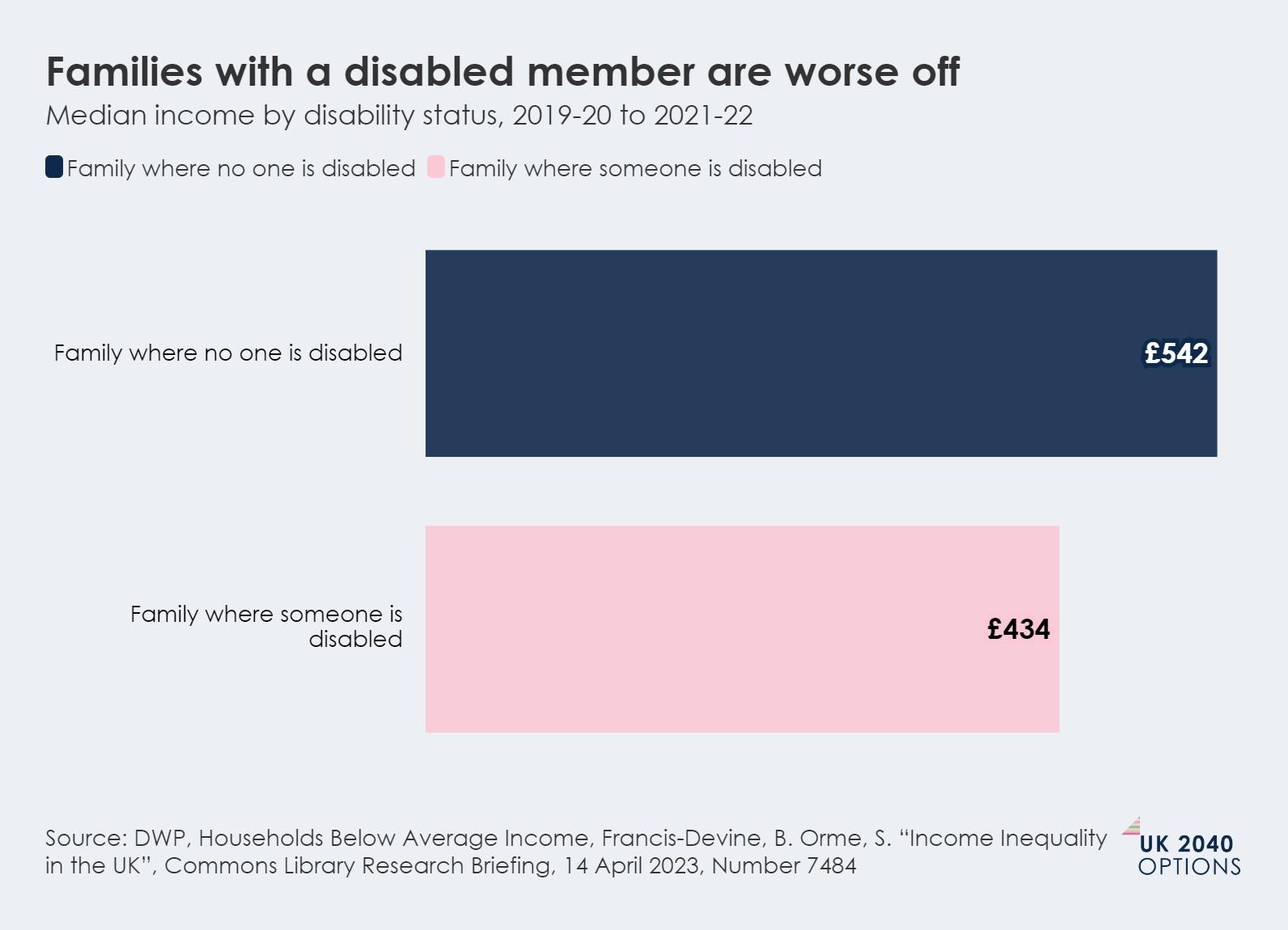
Being disabled, or living in a household where a member is disabled, means you have a significantly lower median income than a family where nobody is disabled.
As the graph below estimates, in 2019-2020 to 2021-2022, households with a disabled family member had an income of £485 before housing costs, which is £119 less than households with no disabled members. This gap would be even larger if we could value the additional costs of having a long-term sickness or disability.
Families with a disabled member are worse off
Median income by disability status, 2019-20 to 2021-22
Wealth is much more unequally distributed in the UK than income
Income inequality only tells us part of the story. Wealth is increasingly a dominant force shaping inequalities within the UK, likely to become even more important as we look to 2040.
At its simplest, income measures the flow of money (such as wages) to a household at a single point in time. Wealth, on the other hand, can be accumulated and held over many years, like a house. Wealth is distributed much more unequally than income in the UK.
Wealth is distributed much more unevenly than income
Esimated Gini coefficients for different income and wealth measures: 2018-20. A Gini coefficient of 100% would represent complete inequality, while a Gini coefficient of 0% would represent complete equality.
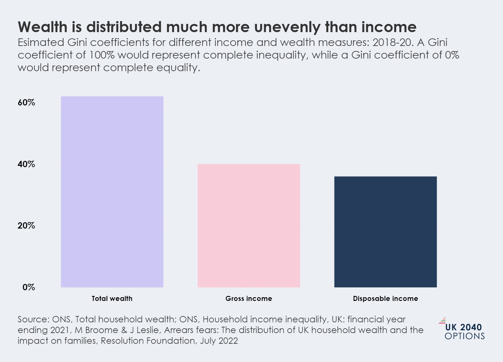
In 2022 the UK had a wealth Gini coefficient of 62%, which is roughly average compared to other OECD countries. Using this measure, levels of wealth inequality in the UK have remained high, but stable, since the 1980s, with the richest 10% consistently owning more than half of total wealth. In 2020, ONS calculated that the richest 10% of households hold 43% of all wealth in the UK. The poorest 50%, by contrast, own just 9%.
The wealth gap in the UK has widened over the past 40 years
Although higher interest rates may now be prompting a reversal to this decades-long trend.
The big change over the past 40 years has been the growing wealth gap. Although the distribution of wealth has not grown more unequal in relative terms – which is behind the relative stability of wealth inequality (which we saw in the fundamental above) – the total value of household wealth has grown hugely over the past few decades, making the gap between the wealthiest and least wealthy much greater in any meaningful sense.
Since 1991, net household wealth has almost doubled relative to GDP, from about three-and-a-half times the GDP in 1991 to over seven times now (based on the most recent ONS data). In 2022, our absolute wealth gap was the second largest in the OECD, as the gap in average wealth between the richest 10th and the poorest 40% is 107 times median income levels – compared to an OECD average of 62 times income. The difference in growth in wealth at different deciles is visible, and stark (see the graph below).
Total wealth for the wealthiest 10% grew by nearly £3 trillion between 2006-2008 and 2018-2020, nearly 25 times more than wealth grew for the bottom 30%
Growth in total wealth and the factors that make it up, 2006-2008 to 2018-2020. Highest wealth decile (top 10%) and lowest 30% wealth decile shown
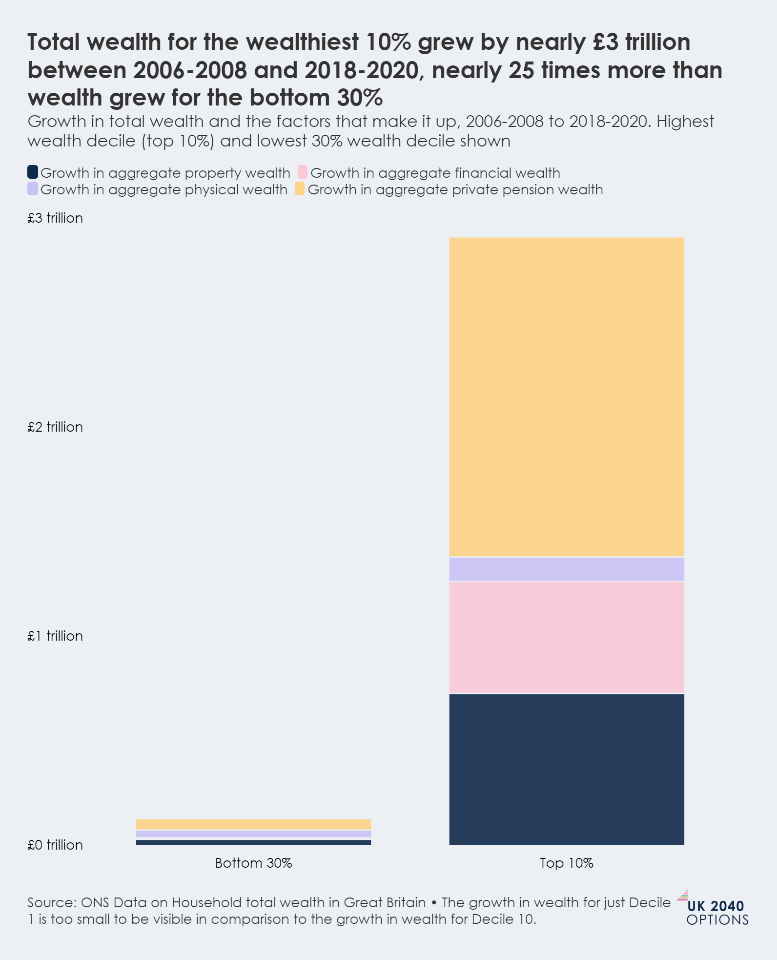
In higher wealth households, much of the growth in wealth can be attributed to growth in aggregate private pension wealth (shown in yellow in the graph above). This now makes up a much higher proportion of median household wealth in the higher deciles.
The wealth gap between the richest and the poorest has widened
Aggregate household total wealth (£ trillion), by decile share of bottom 50% of households compared to top 10% of households
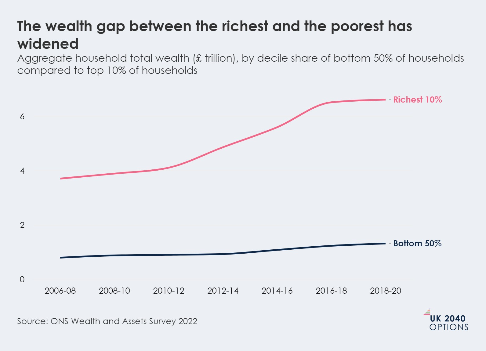
As overall wealth has been growing at a faster rate than income (which, as highlighted in the section on, has stagnated since 2009) some wealthier households have been able to pull further ahead. This combination has made it much harder for the average household: analysis for the Deaton Review of Inequality found that in 2008 it took 10 years' worth of typical full-time gross earnings for a family to move from the middle of the wealth distribution to the top. By 2018, this had increased to almost 16 years.
In real terms, this wealth gap matters. Persistently high wealth gaps can impact an individual's ability to own property or save for their retirement. A lack of wealth, too, can impact an individual's ability to withstand unexpected shocks (such as losing a job or a death) and rising cost pressures, which many families are currently experiencing.
Recent analysis by the Resolution Foundation has identified that higher interest rates are likely to have prompted a reversal to the decades-long trend of rising wealth. The ONS Wealth and Assets Survey is only current through to 2020, meaning there is a lag in what the data can tell us. But the Resolution Foundation analysis suggests that the wealth gap between the richest 10%, and the middle decile has fallen since 2020 by approximately £200,000 (which is six times median household disposable income), leaving it now at just over £1.2 million. This sudden fall shows that the extent of the UK's wealth gap is not inevitable – and that the overall economic environment, as well as policy choices, can make a significant difference.
Some ethnic groups and geographical areas are much more wealthy than others
We can see stark differences in wealth when we consider who holds it, and where those people live.
Most minoritised ethnic groups hold substantially less wealth than the white British majority
On average, households headed by an individual from an ethnic minority group, with the exception of the households headed by an individual in the Indian ethnic group, have substantially less wealth than the white British majority.
There is a stark difference in the wealth held by households headed by different ethnicities
Median total household wealth (£) by ethnicity of the household head: Great Britain, April 2016 to March 2018
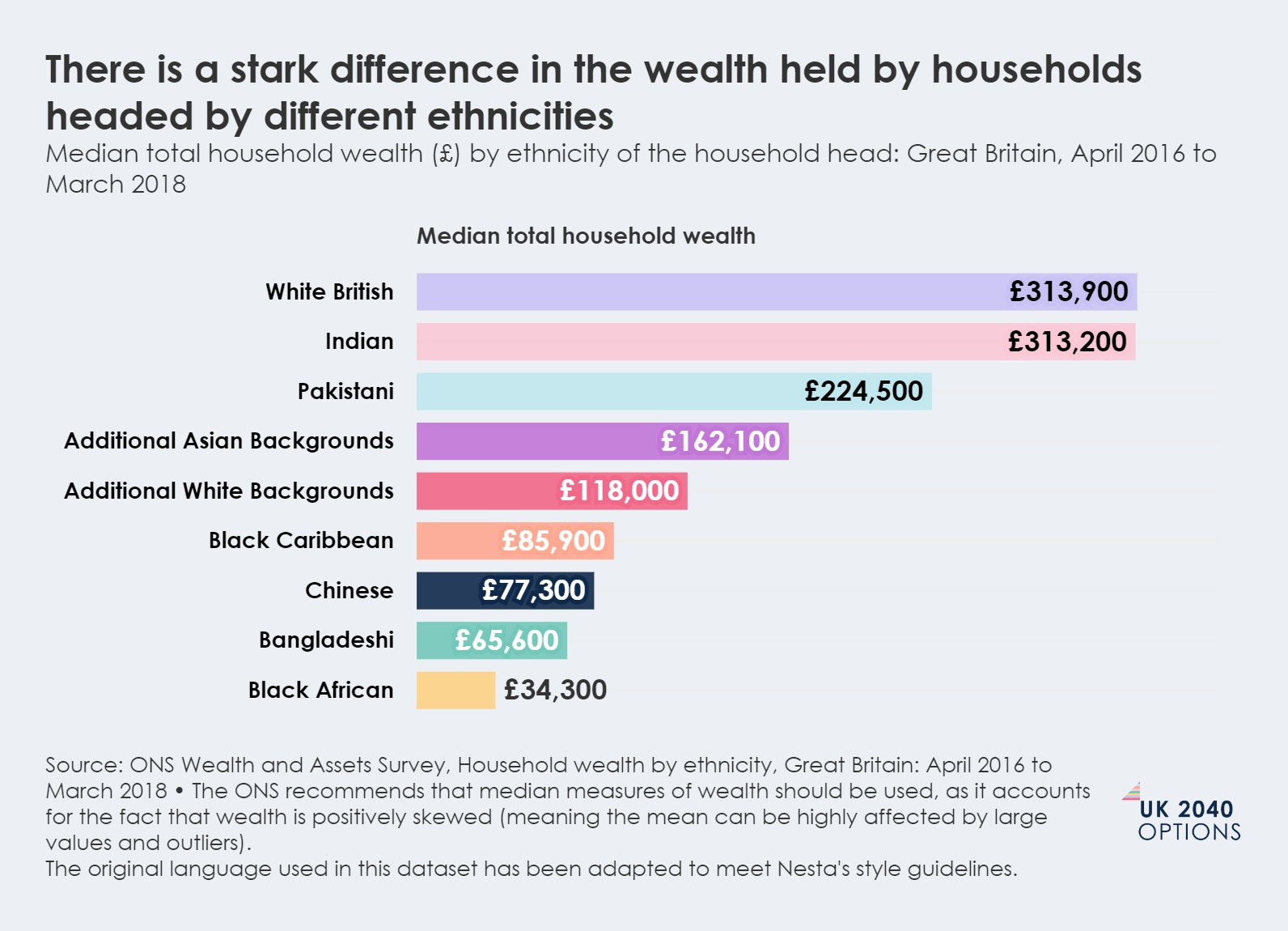
This pattern holds true at all parts of the wealth distribution: research by the London School of Economics has found that the level of household wealth for the wealthiest 5% of individuals in the white British ethnic group is £895,000, nearly three times higher than the £304,000 reported for the wealthiest 5% of people in the Black African ethnic group. Again, the same patterns exist at the other end of the wealth distribution: only 11% of individuals in the Indian ethnic group and 15% of individuals in the white British and Pakistani ethnic groups are in net debt (meaning their assets are less than their debts overall), compared to 31%, 38% and 44% of individuals in the Black Caribbean, Bangladeshi and Black African ethnic groups. These differences in wealth are colossal, and much greater than differences we see in median incomes.
Great Britain has some very wealthy regions, but wealth is not distributed evenly throughout the country
Drawing on ONS data, household median wealth in Great Britain between 2018 and 2020 was £302,500. However, it was almost three times higher in the South East (£503,400) than in the North East (£168,000). And the growth in wealth since 2006 has not been uniform throughout the country: median wealth in the South East rose 43% between 2006 and 2020 (even after adjusting for inflation), while in Scotland and the North East, median wealth decreased by 7% and 12% respectively (again, even after adjusting for inflation).
Wealth is much more unequally distributed regionally than income. For median incomes, which we considered in the section on median incomes, the top region had a typical income that was around 25% greater than the bottom region. When we compare wealth, the difference between the top and the bottom region is around 200%.
We can see clearly from the data: wealth has not yet been 'levelled up'.
People in the richest areas of the country are on average nearly three times as wealthy as those in the poorest areas
Median total household wealth by region, April 2018 to March 2020

Young people today are much less likely to own their own home by 30
The growth in house prices in the UK since the mid-1990s is contributing to these changing patterns of home ownership.
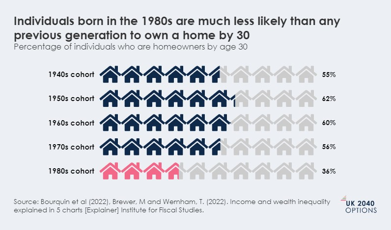
Historically, rates of home ownership in the UK were higher than they are currently: in England, around 71% of households were homeowners in 2003, but this had fallen to 65% just before the Covid-19 pandemic. This fall is concentrated among the younger generations: over 60% of those born in the 1950s and 1960s owned homes by age 30, but now only 36% of those born in the 1980s are homeowners by age 30. This gives the 1980s generational cohort the lowest rate of home ownership since those born in the 1940s.
Individuals born in the 1980s are much less likely than any previous generation to own a home by 30
Percentage of individuals who are homeowners by age 30
These declining rates of home ownership have been driven, in part, by the growth in house prices since the mid-1990s: the value of land in the UK has increased five-fold between 1995-2016, which has contributed to driving up the cost of housing.
A consequence of this is that wealth is becoming increasingly concentrated among older generations who are more likely to own homes, while over half of all working-age adults rent. This is contributing to generational inequality within the UK. Inheritances will, in time, transfer some of the wealth held by older generations to younger cohorts (see section on inheritance below), but this is now likely to happen much later in life, due to greater life expectancy.
Home ownership is also contributing to the wealth gap between different income deciles, and is likely to act, too, as a force that reduces social mobility. Research for the Deaton Review on Inequality has identified that the gap between the percentage of homeowners in the top income decile, which is 73%, and the percentage of those in the middle income decile, which is 50%, has never been greater. Those from low-wealth families are also less likely than those from higher-wealth families to own a home, impacting their ability to assist their children into home ownership.
These differences are again much more stark when we consider ethnicity. With the exception of the Indian ethnic group, all other ethnic minority groups are much less likely than the white British majority to own their home, across all age cohorts. Research by the London School of Economics has found that current home ownership rates, not separated by generational cohort, are largest among people in the Indian (73%) and the white British (at around 69%) ethnic groups, and lowest among people in the Black African (19%), Bangladeshi (around 26%) and the Black Caribbean (37%) groups.
The value of inheritances have doubled over the past 20 years, and are now worth over £100 billion
This amount is likely to double again by 2040, meaning that the changes to how, and how much, people are inheriting will have an ongoing impact on UK society.
The value of inheritances (adjusted for inflation) passed on annually in the UK has doubled roughly every 20 years since 1979, and is now worth over £100 billion. Analysis by the Resolution Foundation predicts that it is expected to double again in England by 2040.
The amount that some households stand to inherit will be significant, giving some the ability to buy houses, or retire early. A typical household led by people born in the 1960s is expected to inherit an amount throughout their lifetimes equivalent to four years the average household earnings for that generation, according to the IFS. For those born in the 1980s, this is even greater: a typical household is expected to inherit an amount equivalent to eight years of average household earnings for their generation.
But inheritances will not stand to impact all in the same way. While the amount of money being passed on has grown, receiving an inheritance is far from a universal experience, with over 53% of adults saying that they did not expect to receive an inheritance at all over their lifetimes.
Whether, what and how much a household may stand to inherit (or receive as a cash transfer) is likely to follow traditional socio-economic divides in the UK, with disparities based on income and wealth, region and ethnicity.
For example, wealthier families are much more likely to benefit from an inheritance, with the wealthiest 20% four or five times more likely to receive an inheritance than the poorest 20% of families. This also holds true for those from higher income families, with the lower income deciles expected to inherit less than their peers in higher income deciles. Again, individuals in ethnic minority groups will tend to receive, on average, significantly smaller intergenerational wealth transfers than those of white British ethnicity. And Demos has identified that a typical person in the south of England born in the 1970s is set to inherit about three and a half times as much as a typical person in the North East: this accords with what we know about wealth accumulation in the UK, with the North East holding the lowest median wealth, and the south of England (South East and South West) the highest.
As we look to 2040, inheritances look likely to have increasingly large impacts on social mobility. The IFS suggests that intergenerational wealth transfers are strengthening the link in living standards between younger cohorts and their parents' circumstances, much more so than was the case for those in earlier cohorts. This may be making inheritances in the UK a force that will act to reduce social mobility, making it harder for some individuals and households to get ahead.
UK 2040 Options
UK Options 2040 supports policymakers as they make choices about what to prioritise and how to deliver: setting out alternative policy options and pathways for the future, creating space for honest debate about the trade offs and testing and interrogating ideas that take us beyond immediate crises.
58 Victoria Embankment
London EC4Y 0DS
+44 (0)20 7438 2500
[email protected]
@nesta_uk
www.nesta.org.uk
Nesta is a registered charity in England and Wales with company number 7706036 and charity number 1144091. Registered as a charity in Scotland number SC042833.
Registered office: 58 Victoria Embankment, London EC4Y 0DS.