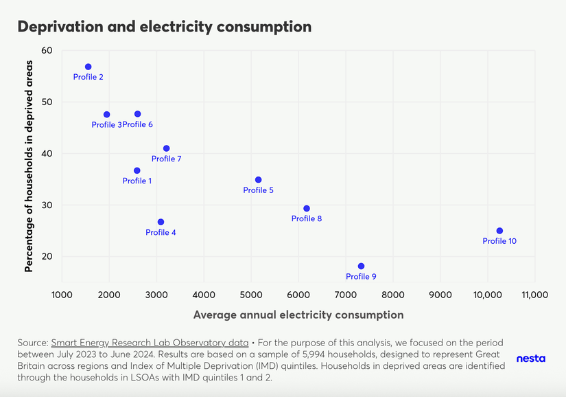
Profiles with households in deprived areas consume less electricity on average than those in the least deprived areas
Deprivation and electricity consumption
Image Description
A scatter plot, titled "Deprivation and electricity consumption", compares the percentage of households in deprived areas to average annual electricity consumption for each energy-use profile. There are 10 bubbles, one representing each energy-use profile. One can observe energy-use profiles with a higher proportion of households in deprived areas (identified through the proportion of households in LSOAs in IMD quintiles 1 and 2) consuming less electricity on average than those with higher proportions of households in the least deprived areas.
The footnote highlights the data source, Smart Energy Research Lab Observatory data and that "For the purpose of this analysis, we focused on the period between July 2023 and June 2024. Results are based on a sample of 5,994 households, designed to represent Great Britain across regions and Index of Multiple Deprivation (IMD) quintiles."
We observe energy-use profiles with a higher proportion of households in deprived areas (identified through the proportion of households in LSOAs in IMD quintiles 1 and 2) consuming less electricity on average than those with higher proportions of households in the least deprived areas.
It is important to note that profiles 2, 3, 6, and 7 all have higher than average proportions of single occupancy (from 26% in profile 6 to 51% in profile 2, in comparison to 13% on average for other profiles). However, this trend may still indicate affordability constraints in addition to lower energy needs or highly energy-efficient homes. In other words, some households in deprived areas with low electricity consumption may be rationing their energy use to manage limited budgets, potentially compromising their comfort and health. This highlights a critical issue of energy equity and the need to ensure all households can afford adequate energy levels.