Average daily consumption curves show distinct consumption behaviours
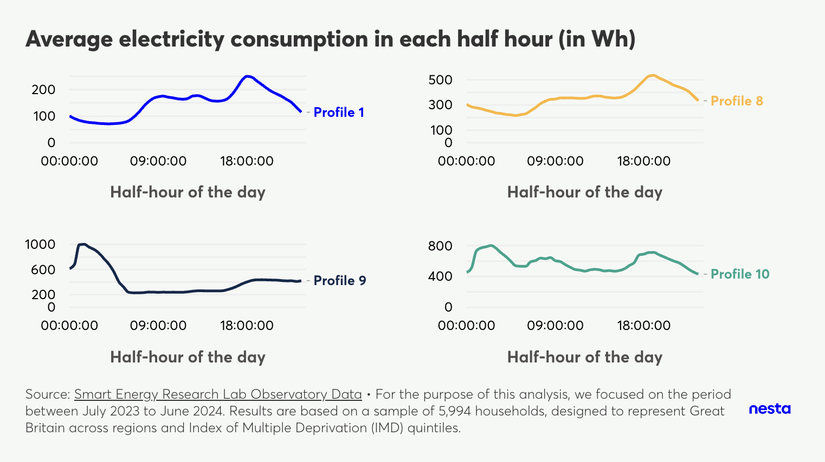
Average electricity consumption in each half hour (in Wh)
Image Description
A grid of 4 charts, titled "Average electricity consumption in each half hour (in Wh), shows the average daily electricity consumption curve for profiles 1, 8, 9 and 10. For each chart, the x-axis shows time of day and the y-axis shows electricity consumption in Wh. One can observe different shapes for different profiles.
The footnote highlights the data source, Smart Energy Research Lab Observatory data and that "For the purpose of this analysis, we focused on the period between July 2023 and June 2024. Results are based on a sample of 5,994 households, designed to represent Great Britain across regions and Index of Multiple Deprivation (IMD) quintiles."
After identifying energy-use profiles, we can analyse the daily electricity and gas consumption patterns of households. As expected, different profiles reveal distinct behaviours. For example, profiles 1 and 8 demonstrate a similar daily electricity consumption trend: an increase in the morning, a smaller peak around lunchtime, and the highest peak after 6pm. However, profile 8 consistently consumes more electricity than profile 1 during each half-hour interval. In contrast, Profile 9 exhibits an overnight peak in electricity consumption, while profile 10 displays multiple peaks throughout the day.