


Overview
Smart meter data can help transition homes away from fossil fuels to electric heating.
Analysing smart meter data plays an essential role in reducing carbon emissions and ensuring a successful energy transition. As low-carbon heating systems such as heat pumps become more widespread, they will place greater demands on the electricity grid (total electricity demand is expected to increase from ~300TWh to ~450TWh by 2035, according to NESO). Ensuring the effective supply of and demand for energy makes it increasingly important to understand household consumption. This requires a clear understanding of how different kinds of households in Great Britain (GB) consume energy, what their daily usage looks like in terms of peaks and falls in consumption, along with what heating systems they own and when they might need to upgrade them.
At Nesta, we analysed smart meter data to understand energy consumption in GB households. We aimed to determine the feasibility of grouping households based on their energy consumption data, identifying the various daily and seasonal patterns, proportions, and amounts of energy people in GB consume. To achieve this, we utilised the Smart Energy Research Lab (SERL) dataset, which offers half-hourly gas and electricity consumption data, along with household survey data, for over 13,000 representative GB households. From this sample, we selected approximately 6,000 households with high-quality data spanning July 2023 to June 2024. The resulting energy-use profiles offer insight into the different ways in which households consume energy, paving the way for more targeted interventions.
The following sections highlight key insights from exploring the energy-use profiles. For a more detailed exploration of the results, please visit energy-use-profiles-explorer.dap-tools.uk.
The video linked below shows a screen recording of how the energy-use profiles explorer can be used.
How to use the energy-profiles explorer
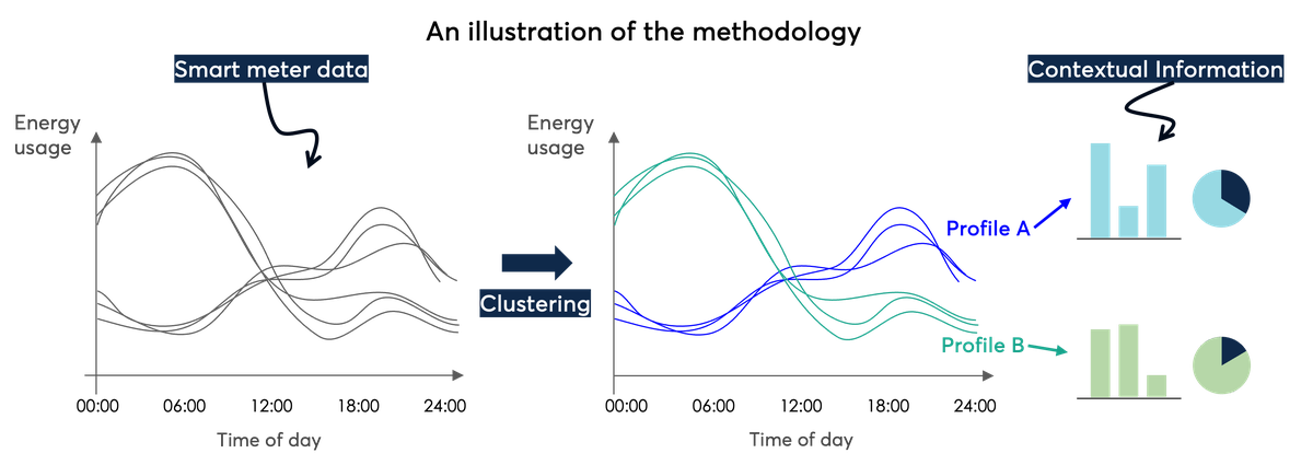
Identifying similar groups of households
How we identified similar groups of households based on energy consumption
To group households effectively, it's essential to decide which characteristics will be used for the grouping. With this in mind, grouping households according to the heating system they own will likely result in a different set of groups compared to grouping households based on the number of people in the household.
An energy-use profile is a group of households that have similar patterns of energy usage. Before identifying energy-use profiles, our multidisciplinary team outlined factors (behaviours, lifestyles and property characteristics) that might contribute to differences in energy consumption patterns. These were then mapped to features we could extract from half-hourly gas and electricity consumption data – what we call smart meter features.
Factors and behaviours that influence energy consumption and how to measure them
To take a look at the complete list of factors, behaviours and respective features, please read the technical appendix.
The range of smart meter features we defined and depicted above (such as average overnight electricity consumption) helps create a fuller picture of household energy consumption than is typically available.
We applied a clustering algorithm – a data science technique used to group data points into clusters based on how close they are to each other – to our dataset of smart meter features to find groups of similar households. For each of these groups, patterns of energy consumption across the day, year and seasons can be visualised. The resulting energy-use profiles help us to see beyond simple accounts of average annual consumption, while still representing coherent groupings of GB households. For example, if you want to help households flex their energy consumption, then you might need to know when they consume energy, but not necessarily how much they consume. You can read more about applications in the section at the end.
Contextualising energy-use profiles
Contextualising energy-use profiles with information about homes and households
Using various methodologies and datasets, different sets of profiles or archetypes of energy consumption can be identified to serve a variety of purposes, such as building daily energy profiles from smart meter data to understand how household energy consumption can change under the influence of different external factors, and Ofgem’s consumer archetypes to understand how changes in the energy system might impact different groups of energy consumers in the population.
In this work, we intentionally limited our analysis to grouping households on smart meter consumption data only. This approach allowed us to create household groups based entirely on their energy consumption patterns, ensuring that no other factors influenced the groupings.
In addition to smart meter data, SERL observatory data also provides more information for each household, including:
- Household details and socio-demographic information: gross annual income, number of occupants, household composition, working status of occupants, region and index of multiple deprivation quintile
- Property details: tenure, property type and age band
- Technologies in the home: presence of solar panels, battery storage, electric heating, smart heating controls, heat pumps and air conditioning units.
This additional information is used to provide context for each profile after profiles are built. As such, profiles might contain a mixture of demographics, heating technologies and property types. By doing this we can assess how profiles differ according to non-consumption factors like the presence of a heat pump or household composition.
The next sections highlight our main learnings.
Energy profiles and household context
Households are not evenly distributed across profiles, reflecting that different proportions of the population have different energy consumption behaviours
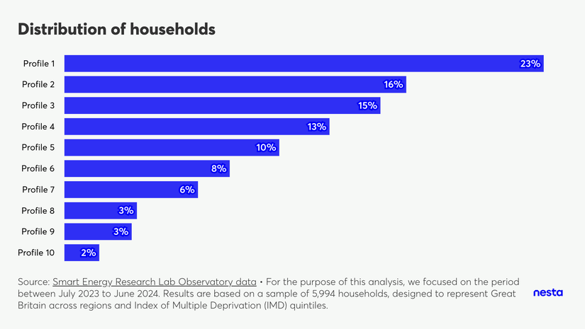
Distribution of households
Image Description
A horizontal bar chart titled "Distribution of households" shows distribution of households by energy-use profile. There are 10 bars, one for each profile, where profile 1 covers 25% of the households (highest value) and profile 10 covers 2% (lowest value).
The footnote highlights the data source, Smart Energy Research Lab Observatory data and that "For the purpose of this analysis, we focused on the period between July 2023 to June 2024. Results are based on a sample of 5,994 households, designed to represent Great Britain across regions and Index of Multiple Deprivation (IMD) quintiles."
Through a mixture of data science techniques and domain knowledge expertise, households were grouped into 10 different energy-use profiles. Results show that households are not evenly distributed, reflecting that different proportions of the population have different energy consumption behaviours. The biggest profile covers 1,374 (23% of) households, while the smallest one covers 100 (2% of) households.
Most households in profiles 7 and 10 don’t consume gas, while most of the other profiles have households that cook or heat their home with gas.
Annual electricity consumption
A profile comprising 2% of households uses four times more electricity, on average, than households in the most commonly observed profile
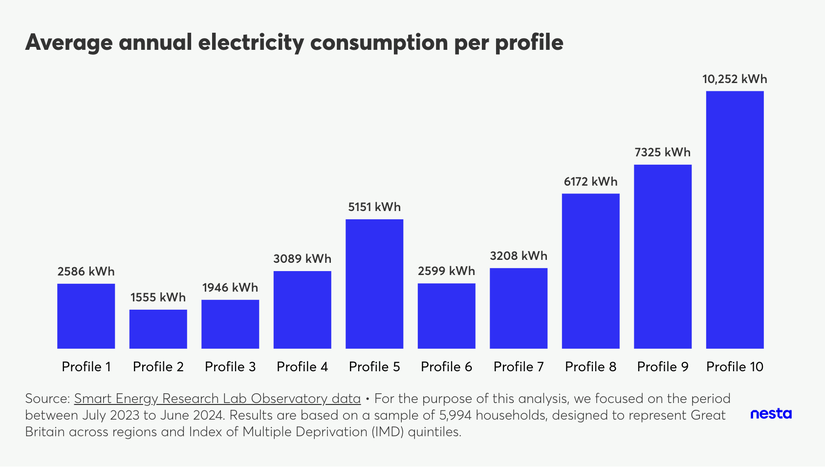
Average annual electricity consumption per profile
Image Description
A vertical bar chart titled "Average annual electricity consumption per profile" shows the average annual electricity consumption in kWh for each energy-use profile. There are 10 bars, one for each profile, where profile 2 has the lowest consumption, at 1555 kWh/per year, and profile 10 has the highest consumption, at 10,252 kWh/per year.
The footnote highlights the data source, Smart Energy Research Lab Observatory data and that "For the purpose of this analysis, we focused on the period between July 2023 to June 2024. Results are based on a sample of 5,994 households, designed to represent Great Britain across regions and Index of Multiple Deprivation (IMD) quintiles."
Consumption varies quite substantially by energy-use profile, with the average household in profiles 8, 9 and 10 (the smallest profiles) consuming substantially more electricity on average when compared to profiles 1, 2 and 3 (the biggest profiles). In fact, the average household in profile 10 consumes four times more electricity than the average household in profile 1.
These consumption disparities are partly influenced by household composition. While all profiles include a mix of single, double, and larger occupancy homes, the distribution of household occupancy within each profile isn't uniform.
Another key factor driving consumption differences is the presence of specific technologies. For example, profiles 3, 9, and 10 have a higher-than-average proportion of households with solar panels: over 20% in these profiles compared to less than 11% in others. This suggests that actual consumption for these households might be even higher than observed – this is true across all profiles, but might be affecting profiles 3, 9 and 10 more due to the higher rates of PV prevalence. They could be directly using electricity generated by their solar panels (electricity exported back to the grid is not included in the results or used to create energy-use profiles).
Key differences between profiles 1 and 10 include the following.
- Presence of solar panels and electric vehicles: over 20% of households in profile 10 have solar panels and/or electric vehicles, whereas less than 5% of households in profile 1 have solar panels and/or electric vehicles.
- Electric central heating: more than 50% of households in profile 10 have electric central heating (with at least 30% owning a heat pump). In contrast, less than 10% of households across all other profiles have electric central heating.
- Household composition: profile 1 has a lower percentage of larger households, with 25% of households having three or more occupants compared to approximately 50% in profile 10. Additionally, profile 1 has a smaller proportion of families with children (14% vs. 27% for profile 10) and a higher proportion of households composed of adults aged 65 or older (39% vs. 28% for profile 10).
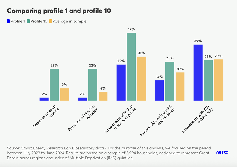
Comparing profile 1 and profile 10
Image Description
A vertical bar chart, titled "Comparing profile 1 and profile 10," compares these two profiles against the sample average based on the presence of solar panels, electric vehicles, and the composition of households (with 3 or more occupants, with children, or with only adults aged 65+).
The footnote highlights the data source, Smart Energy Research Lab Observatory data and that "For the purpose of this analysis, we focused on the period between July 2023 to June 2024. Results are based on a sample of 5,994 households, designed to represent Great Britain across regions and Index of Multiple Deprivation (IMD) quintiles."
Annual gas consumption
A profile comprising 3% of households uses three times more gas, on average, than households in the most commonly observed profile
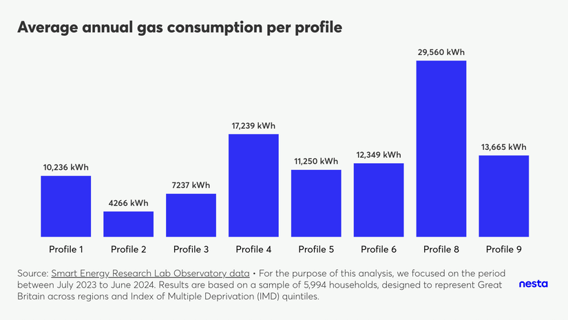
Average annual gas consumption per profile
Image Description
A vertical bar chart titled "Average annual gas consumption per profile" shows the average annual gas consumption in kWh for each energy-use profile. There are 8 bars, one for each profile (except profiles 7 and 10), where profile 2 has the lowest consumption, at 4266 kWh/per year, and profile 10 has the highest consumption, at 29,560 kWh/per year.
The footnote highlights the data source, Smart Energy Research Lab Observatory data and that "For the purpose of this analysis, we focused on the period between July 2023 to June 2024. Results are based on a sample of 5,994 households, designed to represent Great Britain across regions and Index of Multiple Deprivation (IMD) quintiles."
Off-gas homes are primarily found in profiles 7 and 10. Due to the minimal number of on-gas households in these profiles, average annual gas consumption isn't provided as it wouldn't accurately represent these groups.
When it comes to gas consumption, the average household in profile 8 consumes considerably more gas than the average household in profile 1. The average annual consumption for profile 8 stands at 29,560 kWh, roughly three times higher than profile 1's 10,235 kWh. Key differences between these profiles include the following.
- Property type: detached properties are more common in profile 8 (57%) than in profile 1 (31%).
- Property age: almost 50% of homes in profile 8 were constructed before 1930, in comparison to profile 1's 16%.
- Household Demographics: half of profile 8 households comprise three or more people and there is a larger proportion of households with children (28%). In profile 1, only a quarter of households have three or more people, with 14% having children.
- Geographic distribution: profile 8 has the highest concentration of homes within Greater London (23%), whereas profile 1 has only 11%.
- Electric vehicle ownership: profile 8 shows a higher adoption of electric vehicles, with at least 13% of households owning one, compared to just 2% in profile 1.
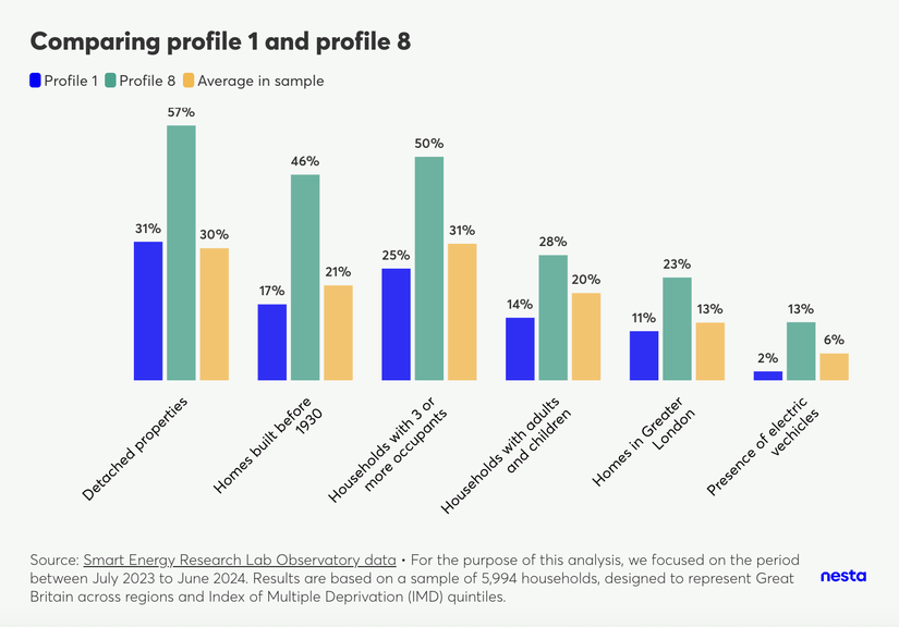
Comparing profile 1 and profile 8
Image Description
A vertical bar chart, titled "Comparing profile 1 and profile 8," compares these two profiles against the sample average based on property information (detached properties, properties built before 1930 and properties in Greater London), presence of electric vehicles and the composition of households (with 3 or more occupants and/or with children).
The footnote highlights the data source, Smart Energy Research Lab Observatory data and that "For the purpose of this analysis, we focused on the period between July 2023 to June 2024. Results are based on a sample of 5,994 households, designed to represent Great Britain across regions and Index of Multiple Deprivation (IMD) quintiles."
Deprivation and energy consumption
Profiles with households in deprived areas consume less electricity on average than those in the least deprived areas
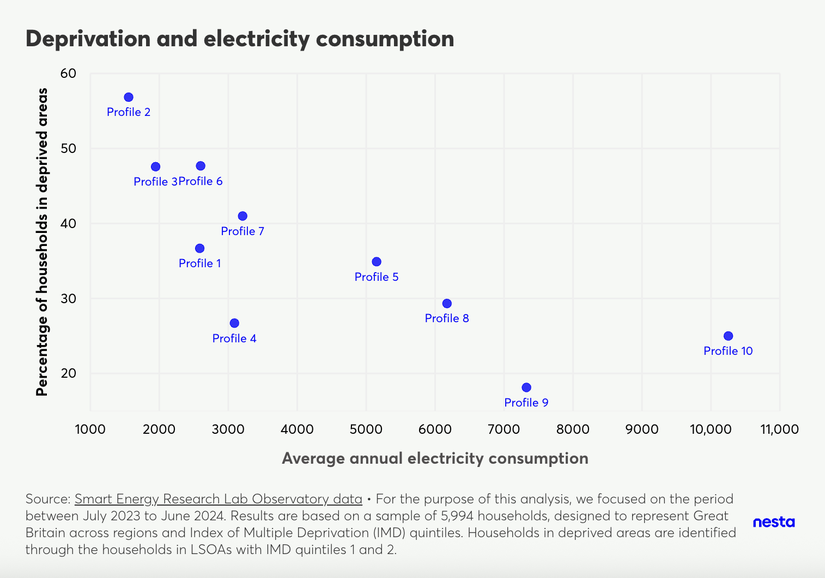
Deprivation and electricity consumption
Image Description
A scatter plot, titled "Deprivation and electricity consumption", compares the percentage of households in deprived areas to average annual electricity consumption for each energy-use profile. There are 10 bubbles, one representing each energy-use profile. One can observe energy-use profiles with a higher proportion of households in deprived areas (identified through the proportion of households in LSOAs in IMD quintiles 1 and 2) consuming less electricity on average than those with higher proportions of households in the least deprived areas.
The footnote highlights the data source, Smart Energy Research Lab Observatory data and that "For the purpose of this analysis, we focused on the period between July 2023 and June 2024. Results are based on a sample of 5,994 households, designed to represent Great Britain across regions and Index of Multiple Deprivation (IMD) quintiles."
We observe energy-use profiles with a higher proportion of households in deprived areas (identified through the proportion of households in LSOAs in IMD quintiles 1 and 2) consuming less electricity on average than those with higher proportions of households in the least deprived areas.
It is important to note that profiles 2, 3, 6, and 7 all have higher than average proportions of single occupancy (from 26% in profile 6 to 51% in profile 2, in comparison to 13% on average for other profiles). However, this trend may still indicate affordability constraints in addition to lower energy needs or highly energy-efficient homes. In other words, some households in deprived areas with low electricity consumption may be rationing their energy use to manage limited budgets, potentially compromising their comfort and health. This highlights a critical issue of energy equity and the need to ensure all households can afford adequate energy levels.
Time-of-use tariffs
Tech-affluent households are starting to make use of time-of-use tariffs
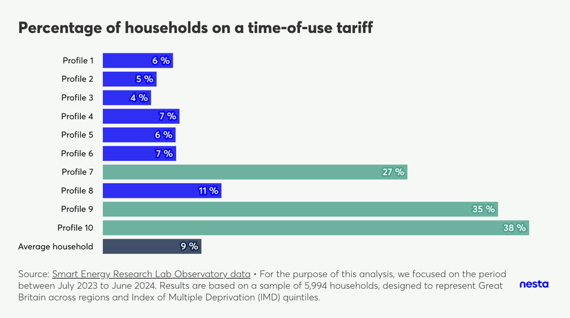
Percentage of households on a time-of-use tariff
Image Description
A horizontal bar chart, titled "Percentage of households on a time-of-use tariff," shows the percentage of households on a time-of-use tariff for each individual energy-use profile in comparison to the average household in the sample. There are 11 bars, 1 for each of the 10 profiles and a final one for the average household in the sample. One can observe that profiles 7, 9 and 10 have a higher-than-average proportion of households on a time-of-use tariff.
The footnote highlights the data source, Smart Energy Research Lab Observatory data and that "For the purpose of this analysis, we focused on the period between July 2023 and June 2024. Results are based on a sample of 5,994 households, designed to represent Great Britain across regions and Index of Multiple Deprivation (IMD) quintiles."
Most households (91%) are on flat-rate electricity tariffs, paying the same price for electricity regardless of when they use it. Only about 9% of homes currently use time-of-use (ToU) tariffs (according to the latest tariff reading between July 2023 and June 2024), which charge different rates based on the time of day. A very small number of households are on block tariffs.
However, data shows that certain groups of ‘tech-affluent’ households are noticeably more likely to be on ToU tariffs. Specifically, profiles 7, 9, and 10 have a much higher adoption of ToU tariffs, with at least 30-40% of households in these groups using them, compared to 9% on average for households in other profiles.
We’re calling these tech-affluent households because we see the presence of electric heating, heat pumps and electric vehicles. A substantial portion of households in profile 7 (44%) and profile 10 (57%) use electric central heating. This is substantially higher than the 1% average in other profiles. Within these, a notable number have heat pumps: at least 6% in profile 7 and 32% in profile 10, compared to less than 1% in other profiles. Many households in profile 9 (at least 60%) and profile 10 (at least 22%) own an EV.
Households with electric heating and EVs can benefit greatly from ToU tariffs by charging their vehicles or running their heating during periods when electricity is cheaper. In fact, research from Cornwall Insights, commissioned by Nesta, shows that heat pump owners could save up to £600 per year just by switching to a time-of-use tariff.
Average daily consumption curves
Average daily consumption curves show distinct consumption behaviours
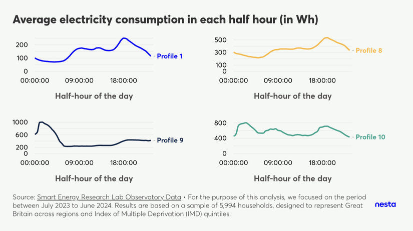
Average electricity consumption in each half hour (in Wh)
Image Description
A grid of 4 charts, titled "Average electricity consumption in each half hour (in Wh), shows the average daily electricity consumption curve for profiles 1, 8, 9 and 10. For each chart, the x-axis shows time of day and the y-axis shows electricity consumption in Wh. One can observe different shapes for different profiles.
The footnote highlights the data source, Smart Energy Research Lab Observatory data and that "For the purpose of this analysis, we focused on the period between July 2023 and June 2024. Results are based on a sample of 5,994 households, designed to represent Great Britain across regions and Index of Multiple Deprivation (IMD) quintiles."
After identifying energy-use profiles, we can analyse the daily electricity and gas consumption patterns of households. As expected, different profiles reveal distinct behaviours. For example, profiles 1 and 8 demonstrate a similar daily electricity consumption trend: an increase in the morning, a smaller peak around lunchtime, and the highest peak after 6pm. However, profile 8 consistently consumes more electricity than profile 1 during each half-hour interval. In contrast, Profile 9 exhibits an overnight peak in electricity consumption, while profile 10 displays multiple peaks throughout the day.
Overnight electricity consumers
There is a small group of ‘overnight electricity consumers’
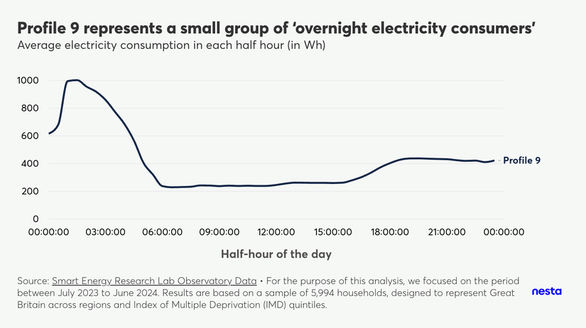
Profile 9 represents a small group of 'overnight electricity consumers'
Image Description
A line chart, titled "Profile 9 represents a small group of ‘overnight electricity consumers'", shows the average daily electricity consumption curve for profile 9, with the x-axis showing time of day and the y-axis shows electricity consumption in Wh. This profile's consumption peaks overnight.
The footnote highlights the data source, Smart Energy Research Lab Observatory data and that "For the purpose of this analysis, we focused on the period between July 2023 and June 2024. Results are based on a sample of 5,994 households, designed to represent Great Britain across regions and Index of Multiple Deprivation (IMD) quintiles."
Profile 9, representing 3% of households, is the group of "overnight electricity consumers". This group's consumption peaks overnight, likely driven by electric vehicle ownership (over 60% own an EV) and battery storage (at least 8%). These are affluent, high-tech households, with many owning solar panels (over 21%) and air conditioning (over 10%). They tend to be larger families (over 64% have three or more occupants) residing in detached properties (over 50%).
It's worth noting that smaller profiles like profile 9 are often easier to characterise because their specific technology ownership provides clearer distinguishing features. These smaller profiles also represent ‘emergent’ profiles that will grow over time.
Trimodal electric heating peaks
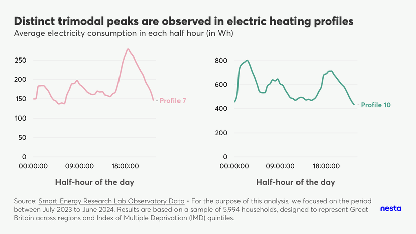
Distinct trimodal peaks are observed in electric heating profiles
https://flo.uri.sh/visualisation/24395768/embed
Image Description
A grid of 2 charts, titled "Distinct trimodal peaks are observed in electric heating profiles", shows the average daily electricity consumption curve for profiles 7 and 10. For each chart, the x-axis shows time of day and the y-axis shows electricity consumption in Wh. Both profiles have distinct trimodal peaks.
The footnote highlights the data source, Smart Energy Research Lab Observatory data and that "For the purpose of this analysis, we focused on the period between July 2023 and June 2024. Results are based on a sample of 5,994 households, designed to represent Great Britain across regions and Index of Multiple Deprivation (IMD) quintiles."
While most electricity consumption profiles show a morning increase and an evening peak, profiles 7 and 10 exhibit particularly distinct trimodal peaks throughout the day. These profiles are characterised by a higher than average proportion of households with electric central heating systems, particularly heat pumps. It's important to note that these trend lines represent the average electricity consumption per profile on a typical day, not individual household consumption. Therefore, these aggregated profiles might be combining diverse behaviours from various households within each group.
Constant high gas usage
Some households exhibit constant high gas usage throughout the day
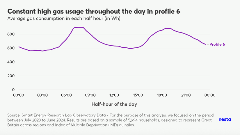
Constant high gas usage throughout the day in profile 6
Image Description
A line chart, titled "Constant high gas usage throughout the day in profile 6", shows the average daily gas consumption curve for profile 6, with the x-axis showing time of day and the y-axis showing gas consumption in Wh. Unlike other profiles, profile 6 shows a constant high gas usage throughout the day.
The footnote highlights the data source, Smart Energy Research Lab Observatory data and that "For the purpose of this analysis, we focused on the period between July 2023 and June 2024. Results are based on a sample of 5,994 households, designed to represent Great Britain across regions and Index of Multiple Deprivation (IMD) quintiles."
As observed across various profiles, average gas consumption generally peaks in the morning and evening. However, profile 6 exhibits this trend less prominently, with households maintaining consistently high gas consumption throughout the day.
Several factors likely contribute to this, including the following.
- Presence of non-working adults: 40% of households in profile 6 consist solely of non-working adults, suggesting a greater likelihood of occupants being home throughout the day.
- Presence of gas central heating: the presence of gas central heating, potentially used consistently throughout the day, also contributes to sustained consumption.
This behaviour is particularly noteworthy given that nearly 50% of homes in this profile are located in deprived areas (although not necessarily meaning that households themselves are deprived). However, we can observe that other profiles with comparable or higher proportions of non-working adults and/or individuals over 65, as well as similar gas heating characteristics, do not display the same consistently high consumption as presented by profile 6.
Applications of this work
Applications of this work
Understanding, predicting and simulating
The 10 energy-use profiles in this publication offer a foundational understanding of how households use energy in GB. While these profiles serve a specific purpose, the underlying methodology can be adapted to serve various use cases. These energy-use profiles help answer questions like:
- What proportion of the population consumes energy in a certain way, and how much do they consume on average?
- What are the characteristics of a specific energy-use profile?
- Which energy-use profile should the government target to tackle fuel poverty?
Beyond understanding, energy-use profiles can be used to predict which group a household belongs to, based on their energy usage and/or underlying characteristics. Energy-use profiles can also be used to simulate changes to household energy consumption. For example, one could model the impact of a household switching from fossil fuel heating to a heat pump, or explore what happens if 10% of the population with specific characteristics change or flex their energy demand.
Potential applications of energy-use profiles include the following.
- Identifying those underheating their homes and/or in fuel poverty: accurate identification of underheating and fuel poverty can enable better policy-making, efficient allocation of resources and funding, leading to decreased inequality and increased health and wellbeing.
- Providing personalised recommendations and advice to consumers: these profiles can be used to offer personalised energy-saving advice (and incentives) tailored to the specific consumption patterns of each household’s profile, optimising energy usage and saving money.
- Grid load forecasting: understanding when and how different household types consume energy allows for more accurate load forecasting. This is crucial in day-to-day forecasting of peak demand, but also for predicting how demand and peak demand will change as we approach 2050, with homes transitioning through profiles as their occupants and/or property characteristics/assets change.
- Carbon Footprint Analysis: energy-use profiles can be used to estimate the carbon footprint of different profiles, helping households and policymakers understand and reduce their environmental impact.
- Work on energy equity: in general, energy-use profiles can be used to identify and address energy inequities, such as providing support to low-income households that may have high energy costs relative to their income.
Explore more in your own time
To explore the insights presented in this report in your own time (including seasonal differences), visit energy-use-profiles-explorer.dap-tools.uk.
Caveats and limitations of this work
Caveats and limitations of this work
Small sample of households & information sharing
The Smart Energy Research Lab (SERL) data contains smart meter and contextual data from over 13,000 households. However, not all of these households met the criteria for inclusion in this analysis. For instance, some were excluded because their data did not span the entire analysis period. Ultimately, to ensure the sample remains representative of Great Britain, we focused our analysis on a smaller, refined sample of approximately 6,000 households.
The process of defining the number of energy profiles is a careful balance of data science insights and expert domain knowledge. It's crucial that these profiles are of an appropriate size – not so small that they prevent us from showing meaningful information due to statistical disclosure rules, nor so large that they lose their usefulness. Our current sample size means some profiles are quite small, which can limit our ability to provide granular breakdowns, such as property type distributions within specific profiles. This issue is further enhanced by missing contextual information, given that a proportion of values is unknown for some variables, often requiring us to group unknown categories with known ones due to low counts.
With a larger sample or enhanced synthetic data, we could further refine these profiles to identify ‘true archetypes’ of energy consumption and household characteristics. Making high-fidelity synthetic smart meter data openly available is crucial for leveraging this information to inform the energy transition.
Extracting actionable insights
Households were clustered using consumption data. Sociodemographic and other contextual information are not well clustered, making it hard to identify ‘true archetypes’ and identify meaningful insight. As an example, wealthy households with solar panels and low-income households might cluster together if both have low electricity consumption (although for different reasons).
Information gap for low-income and deprived households
We often have less to say about those on low incomes and in more deprived areas, as they typically don’t have technologies such as heat pumps or solar panels installed in the house.
Inherent bias in data
The data we have access to comes from houses with smart meters; hence, the data is inherently biased to what we can learn from homes with smart meters. Smart meter coverage is still quite low in GB, with the latest statistics showing the number of installations in the UK reached 66% of homes and small businesses, with 39 million smart and advanced meters in operation across Great Britain as of the end of 2024.
You can find detailed information about the underlying methodology in this document.
Citations and acknowledgements
Smart Energy Observatory Lab data citation
Elam, S., Few, J., McKenna, E., Hanmer, C., Pullinger, M., Zapata-Webborn, E., Oreszczyn, T., Anderson, B., Department for Levelling Up, Housing and Communities, European Centre for Medium-Range Weather Forecasts, Royal Mail Group Limited. (2024). Smart Energy Research Lab Observatory Data, 2019-2024: Secure Access. [data collection]. 8th Edition. UK Data Service. SN: 8666, DOI: http://doi.org/10.5255/UKDA-SN-8666-8
Acknowledgements
Thank you to Martin Pullinger and James O’Toole from the team at University College London for support with SERL and UK Data Service-related queries.
The authors would also like to acknowledge the sustainable future and data science teams at Nesta for the work, support and suggestions provided during the project. Particular thanks go to: Andy Regan, Michael Fell and Max Wollard for domain knowledge support; Daniel Lewis and Liz Gallagher for advising on data science; Daniel Lewis, Max Wollard and Seth Caldwell for reviewing and ensuring the quality of this publication; Elysia Lucas for reviewing the energy-use profiles explorer; and Eve Lerouge for working on applications and mapping applications to stakeholder needs.


